

Branding
In Print Materials , Digital Platforms & Space Design
………………………………………………………………………………..……………………………..………………………………..……………
Telecom Company - Rightel
Brand Identity and Guidelines
Objective
Rightel, the third mobile operator in the region, launched after two well-established competitors that held the first and second positions in terms of market share and subscribers. The objective was to create a dynamic and modern brand identity that not only stood out against these competitors but also appealed to Rightel’s target demographic. This involved adapting the brand to evolving market trends and technological advancements to attract and retain a younger, tech-savvy audience.
Concept and Design Development
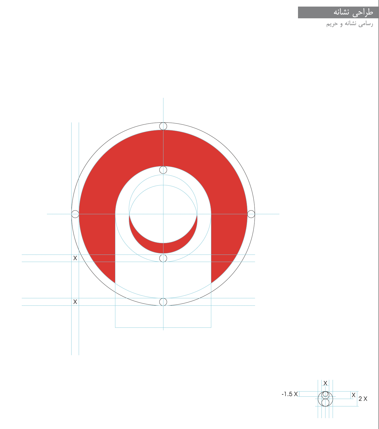
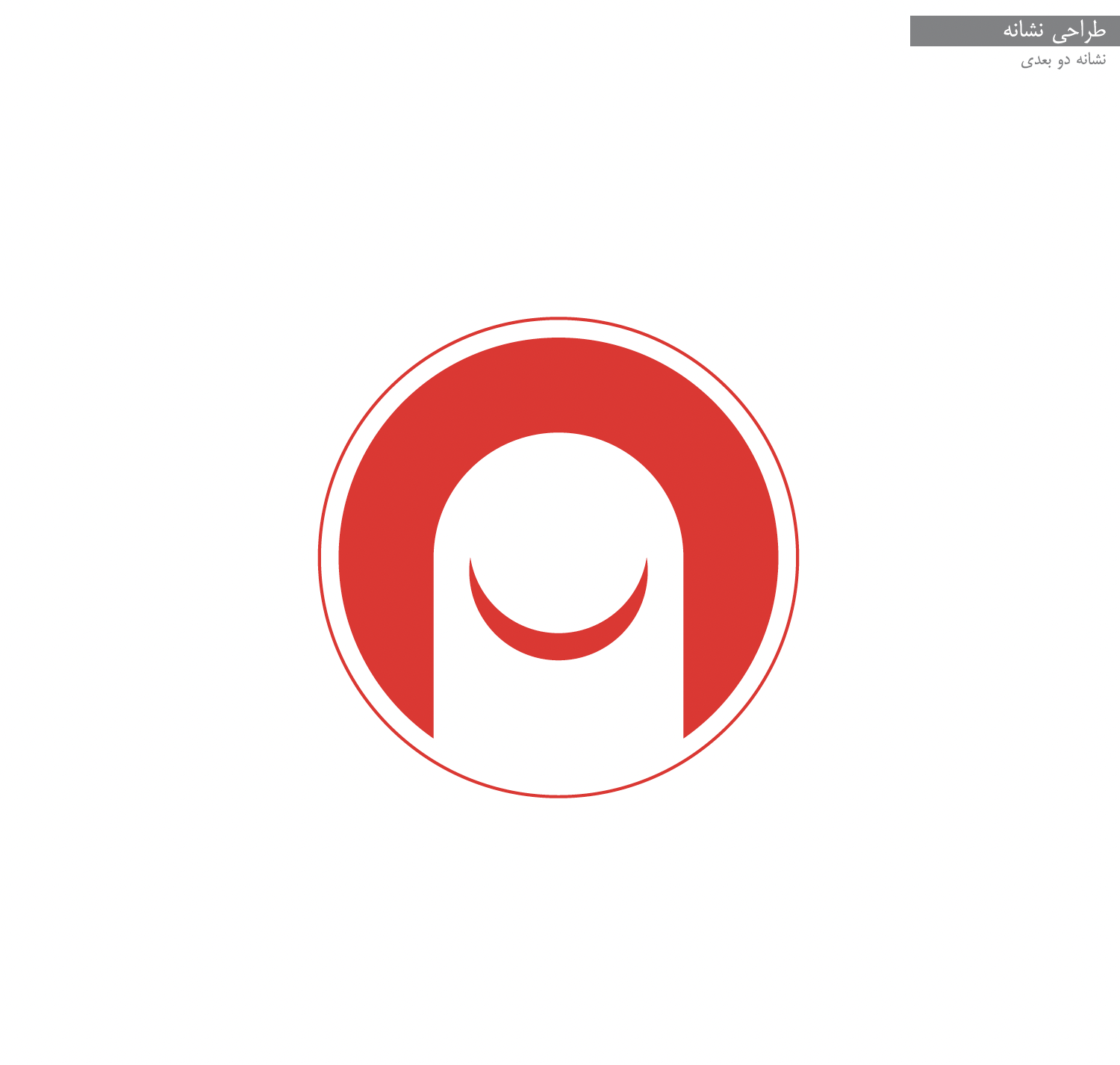
The Rightel logo uses a circular motif to symbolize connectivity and continuous communication, essential in telecom. The curved lines represent signal flow, emphasizing fluidity. To differentiate from competitors, Rightel adopted a vibrant magenta and dynamic design, standing out from the more conservative, angular logos of its competitors, appealing to a younger, tech-savvy audience.
Concept and Design Development
The Rightel logo uses a circular motif to symbolize connectivity and continuous communication, essential in telecom. The curved lines represent signal flow, emphasizing fluidity. To differentiate from competitors, Rightel adopted a vibrant magenta and dynamic design, standing out from the more conservative, angular logos of its competitors, appealing to a younger, tech-savvy audience.
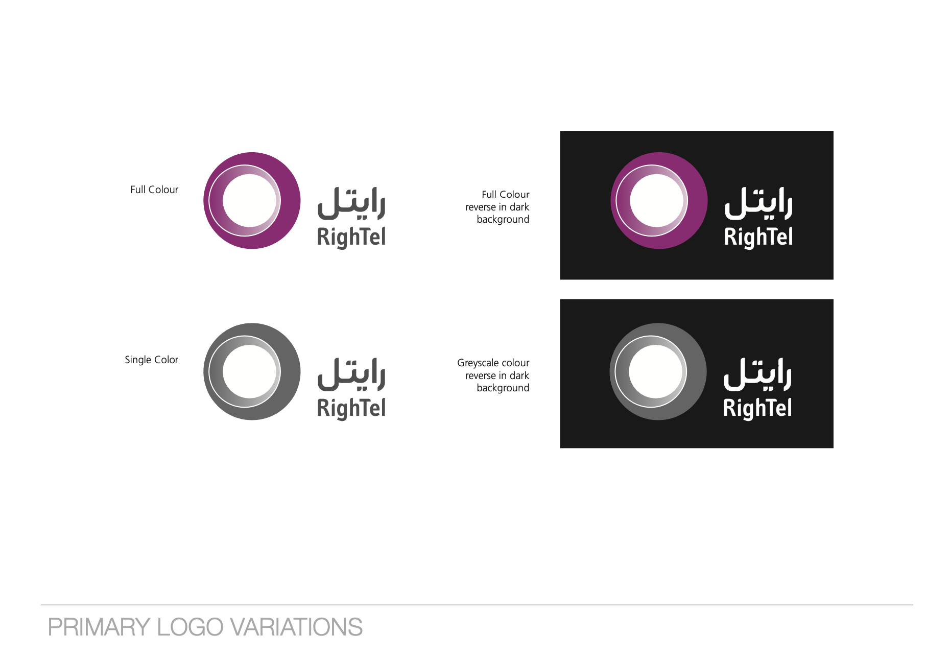
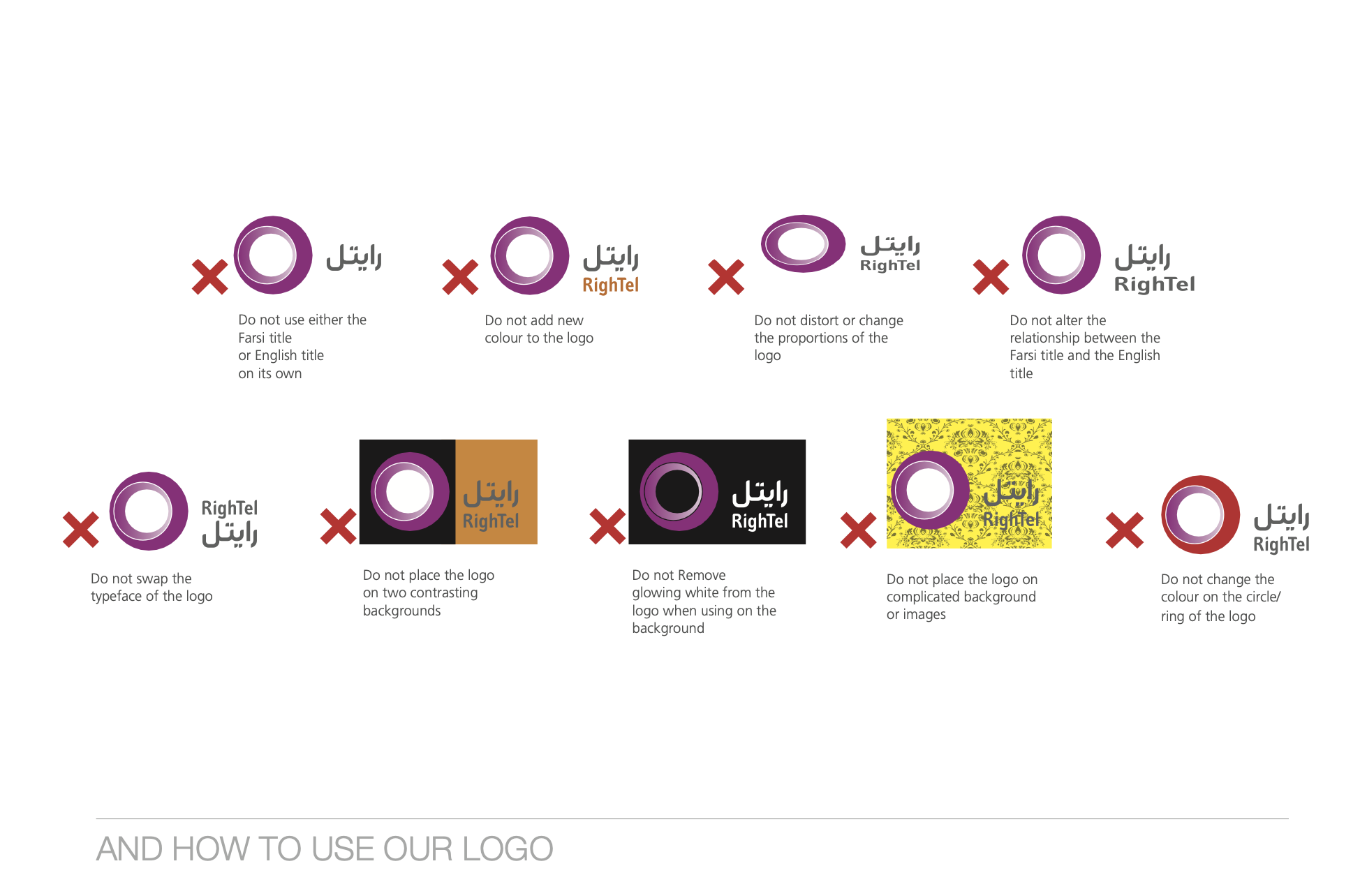
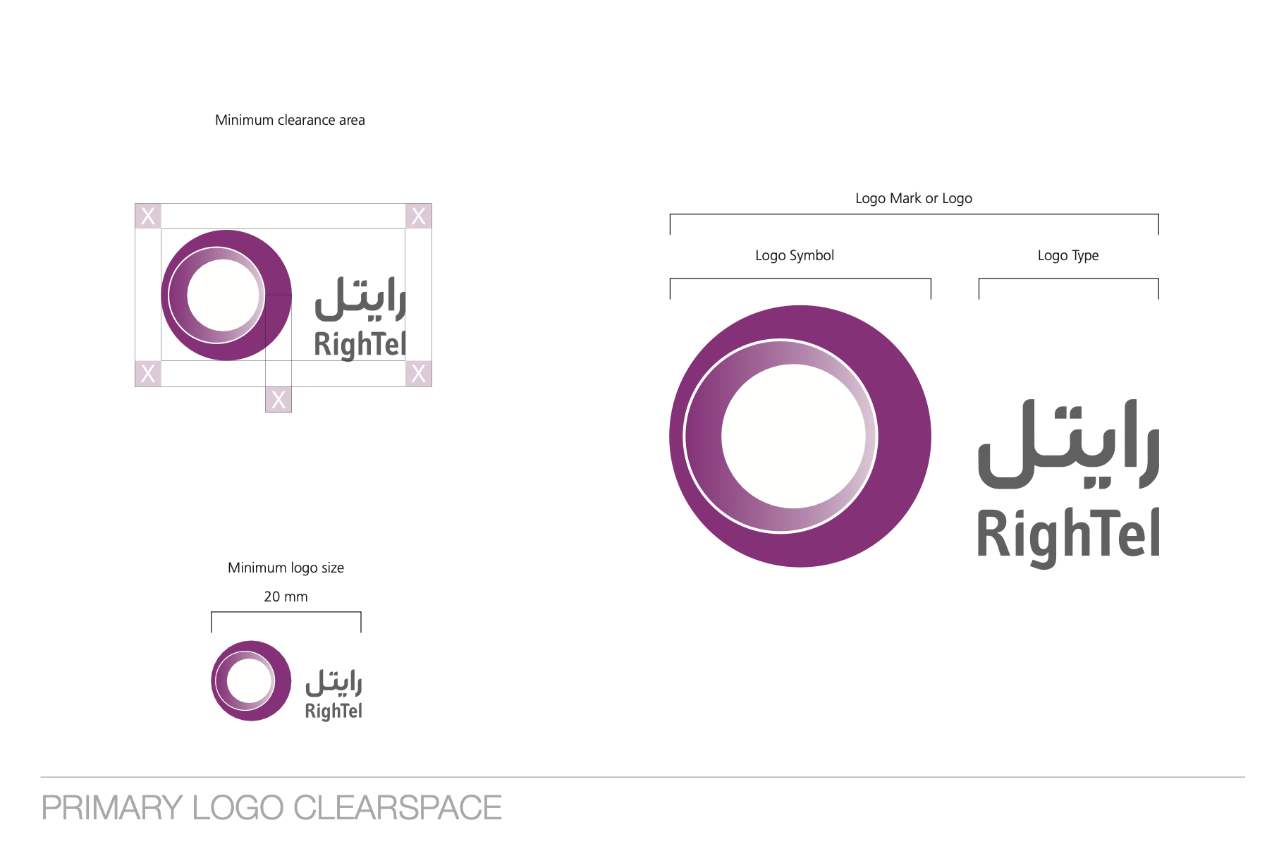
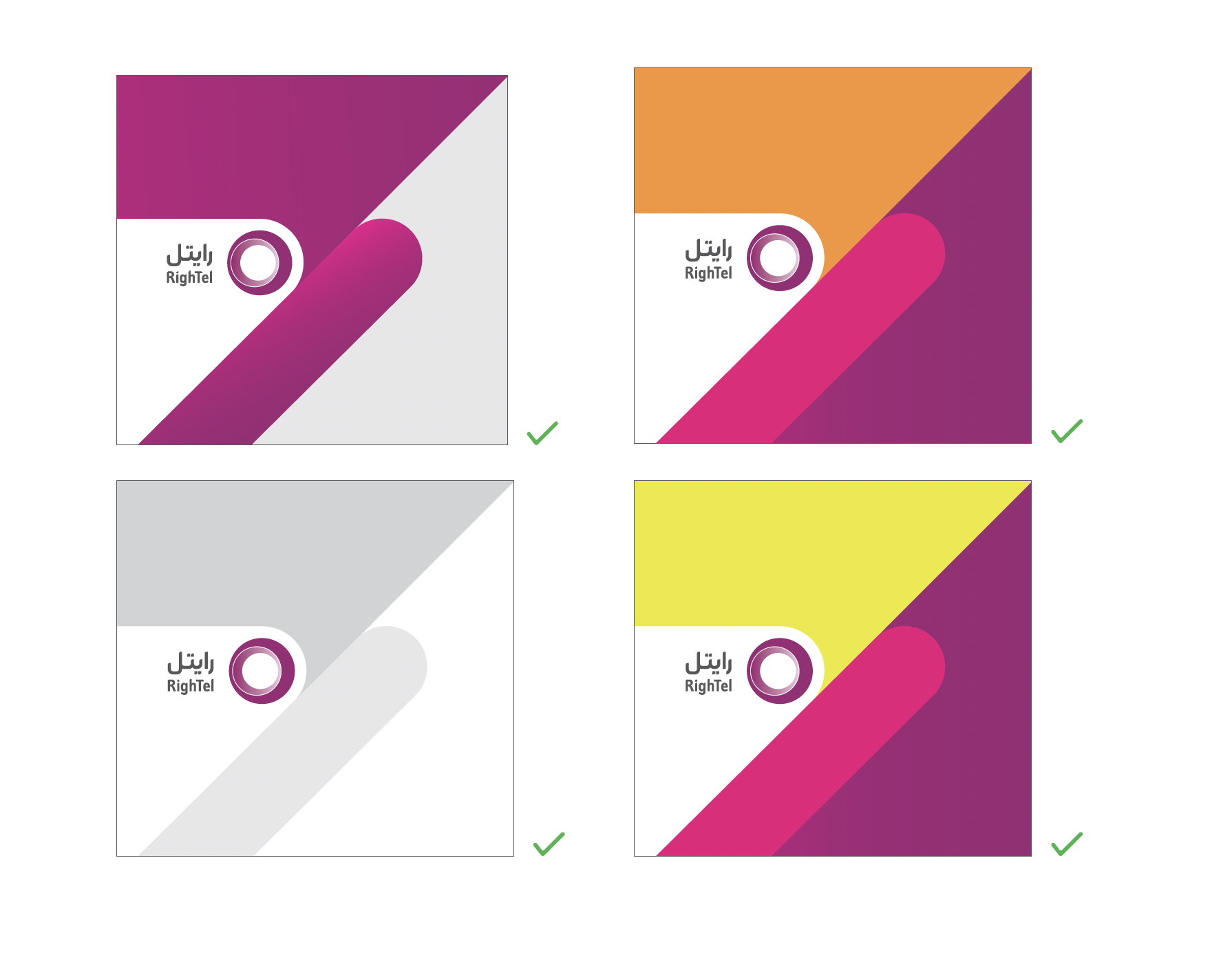
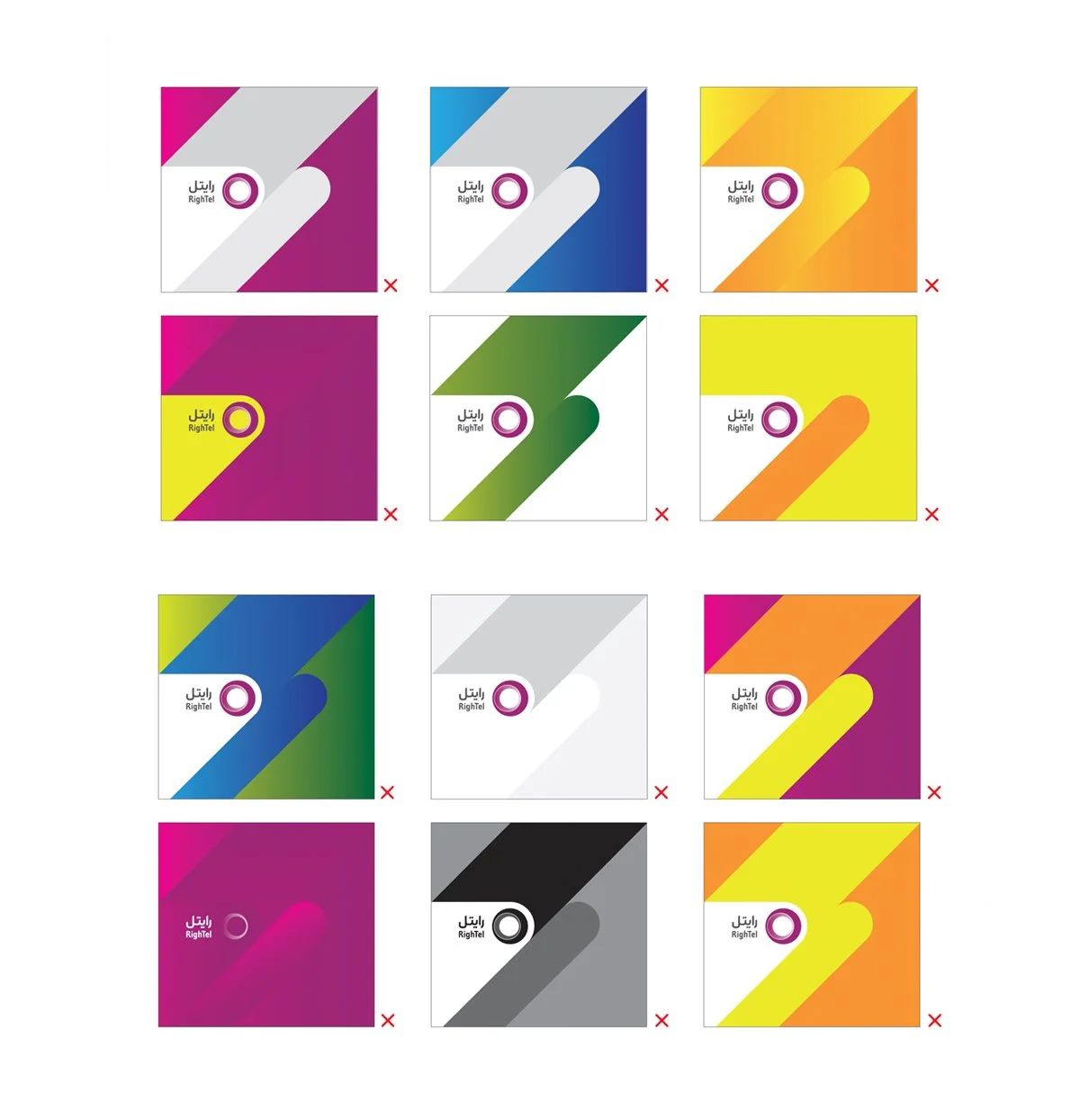
Logo Usage Guidelines
The Rightel logo usage guidelines ensure consistency and impact across all platforms. These guidelines emphasize maintaining clear space, correct proportions, and proper color use. Alterations, such as changing colors, distorting the logo, or using elements separately, are not allowed, and the logo should not be placed on complex backgrounds to preserve visibility and brand recognition.
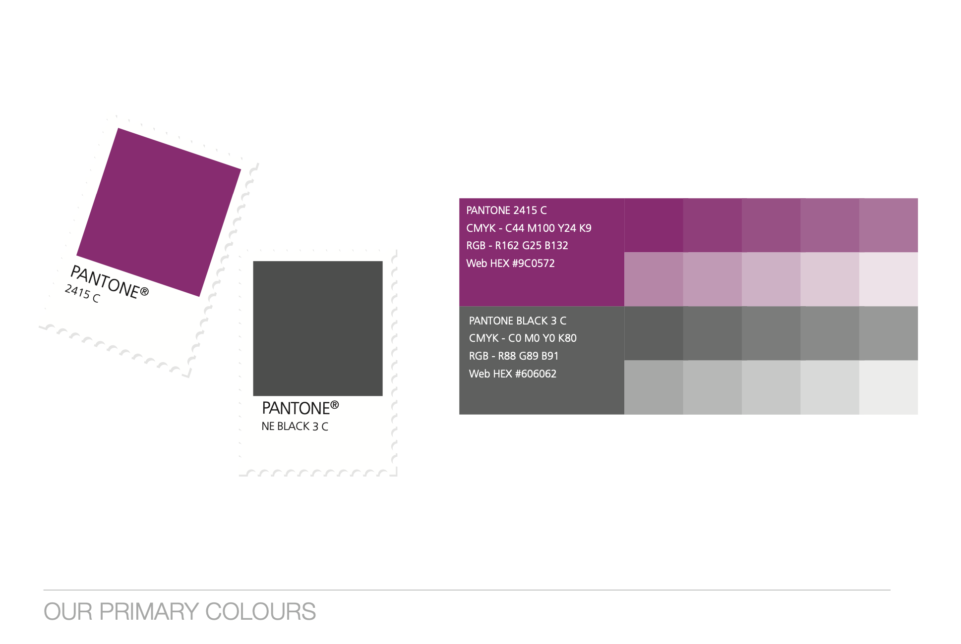
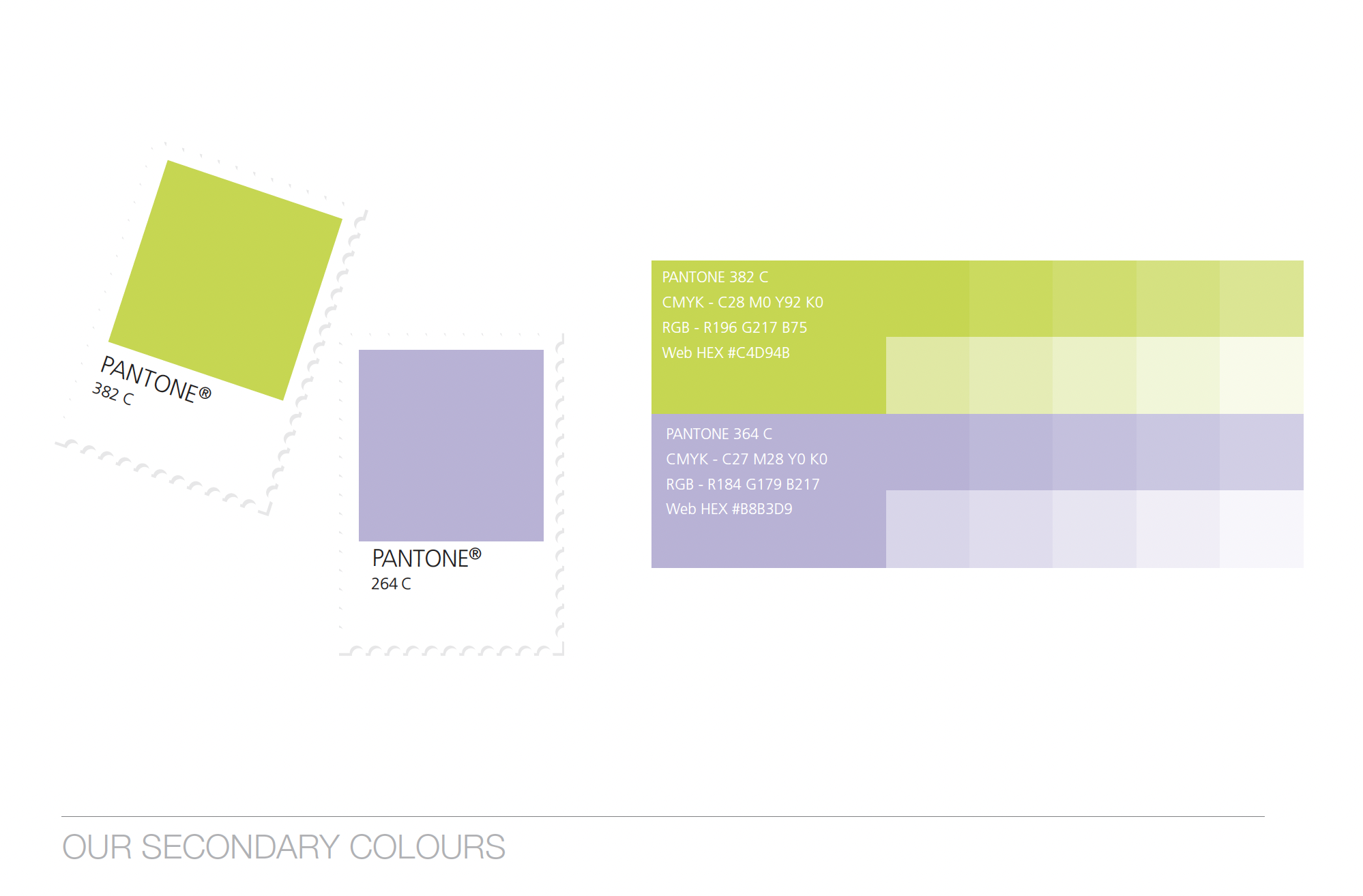
Primary & Secondary Colors
Rightel's color palette includes a bold magenta (Pantone 2415 C) and neutral gray (Pantone Black 3 C) as primary colors, reflecting energy, innovation, and professionalism. The tonal variations within these colors allow for flexible use across various media, maintaining a consistent and modern brand identity. The secondary palette features a vibrant lime green (Pantone 382 C) and soft lavender (Pantone 264 C), offering additional depth and versatility to the brand’s visuals, with tones that ensure a fresh and dynamic appearance in different contexts.
Rightel Brand department
Brand Team Member / Brand Specialist
BI Design
Brand Guideline Update
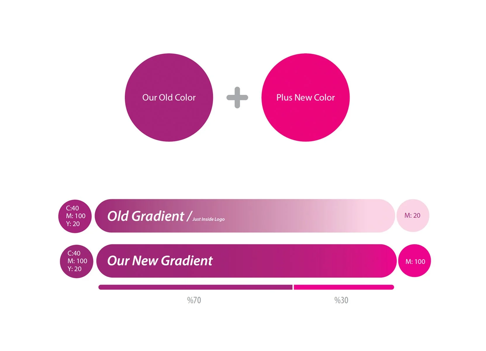
As part of enhancing Rightel's brand guidelines and responding to the broader and younger target market, we made several updates to the logo’s placement and color palette. These updates introduced new do's and don'ts in the brand guideline to ensure consistent usage while aligning with the refreshed brand identity.
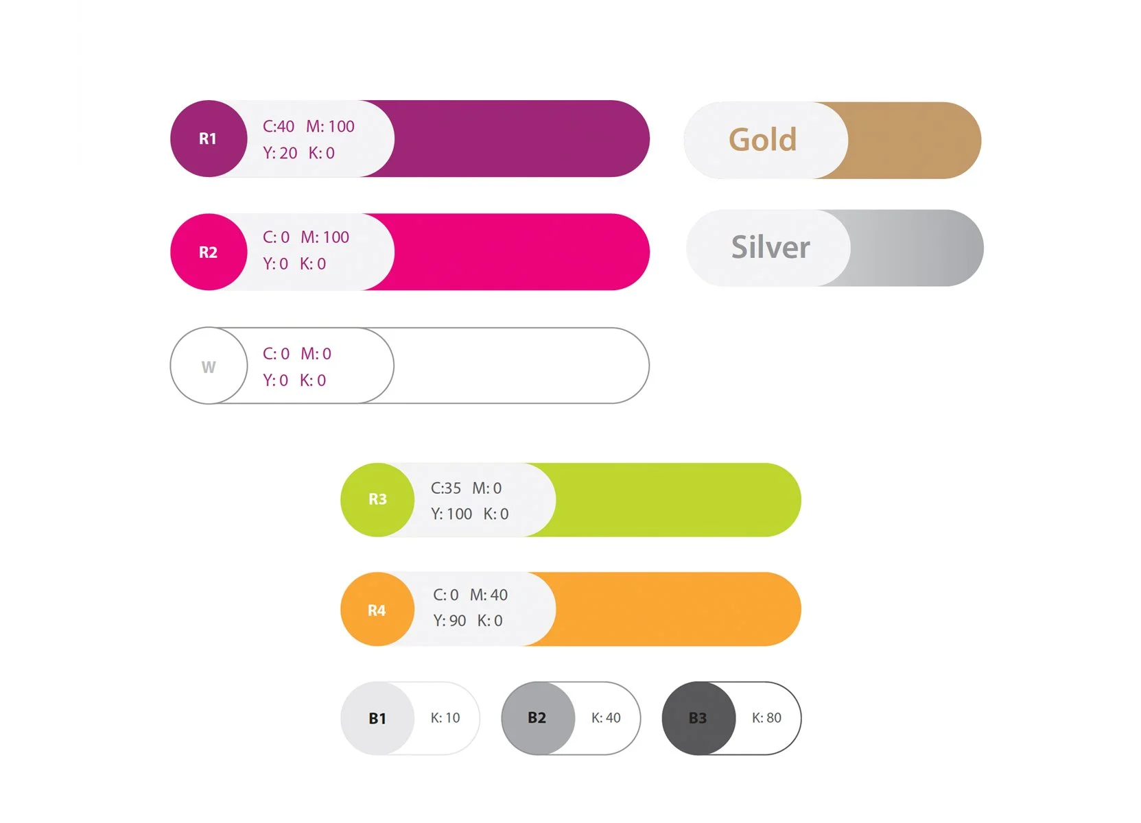
To create a more dynamic and modern brand, new colors were added to the palette. This was necessary due to the expansion of Rightel’s product range, particularly to distinguish the packaging for SIM cards and recharge cards. The new color additions helped Rightel’s products stand out more effectively, contributing to a fresher and more vibrant brand presence
Color Expansion
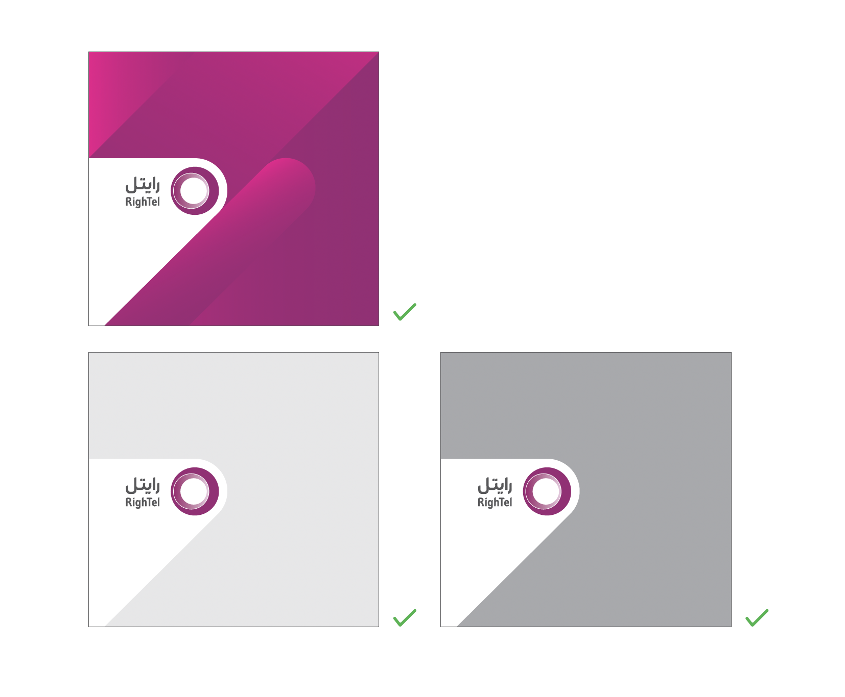
Logo Background Color Usage: Do's and Don'ts
With the rebranding and new placement of the Rightel logo, specific guidelines were introduced to ensure proper background color usage. The logo should be placed on backgrounds that maintain clear visibility and brand integrity. Do use consistent color schemes that complement the brand palette, such as neutral tones or combinations from the primary and secondary palettes. Don’t place the logo on backgrounds with high contrast or clashing colors that reduce visibility, or use overly complex patterns that distract from the logo's clarity.
Brand team member / Team Lead
Brand Redesign
2014-2015
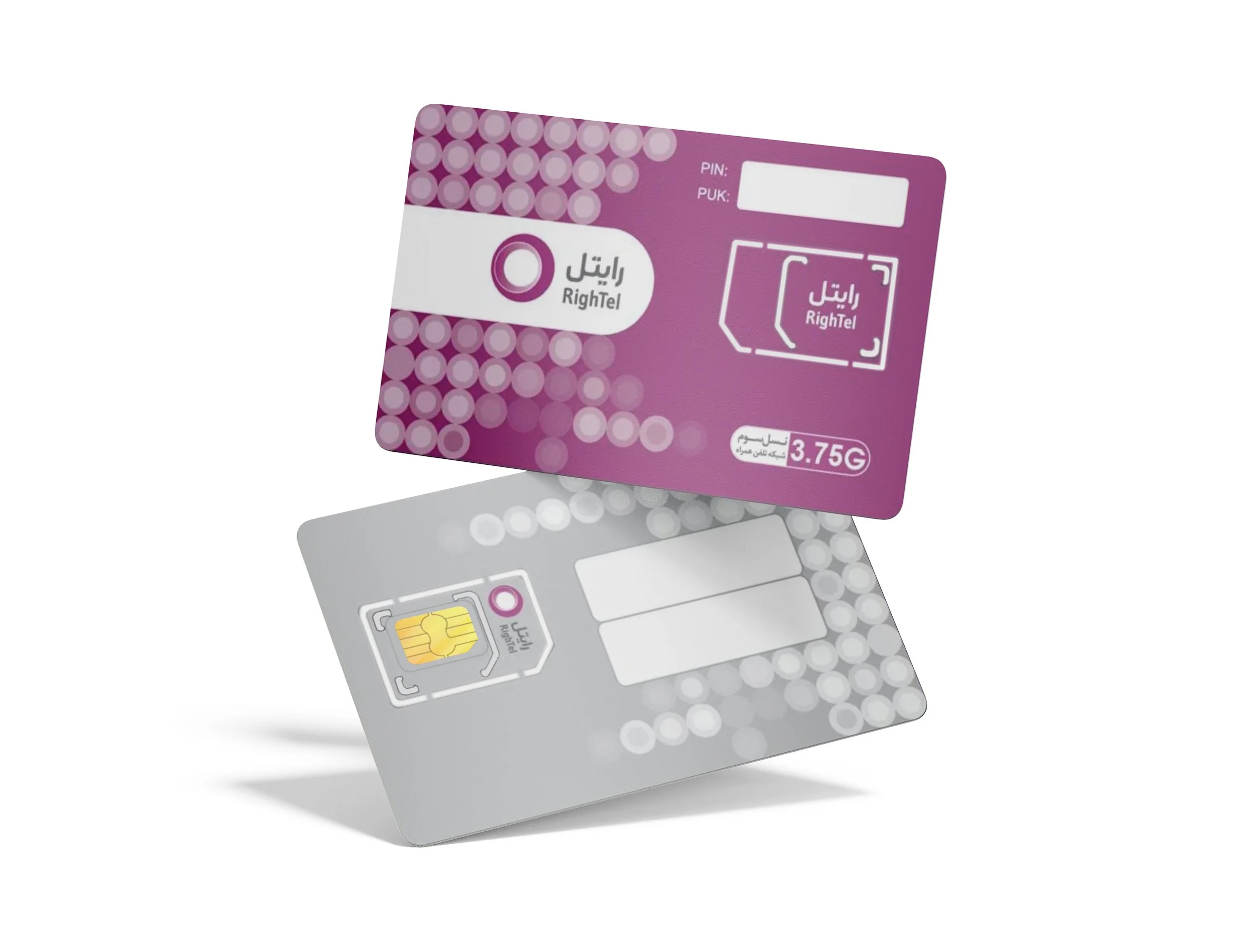
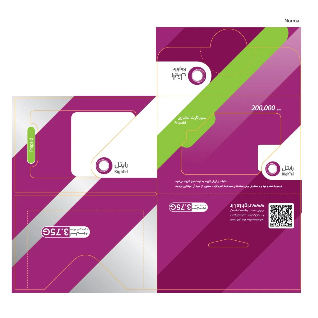
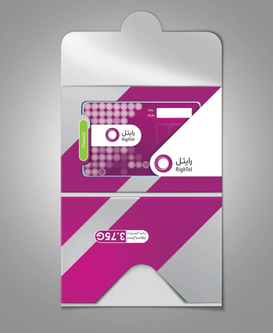
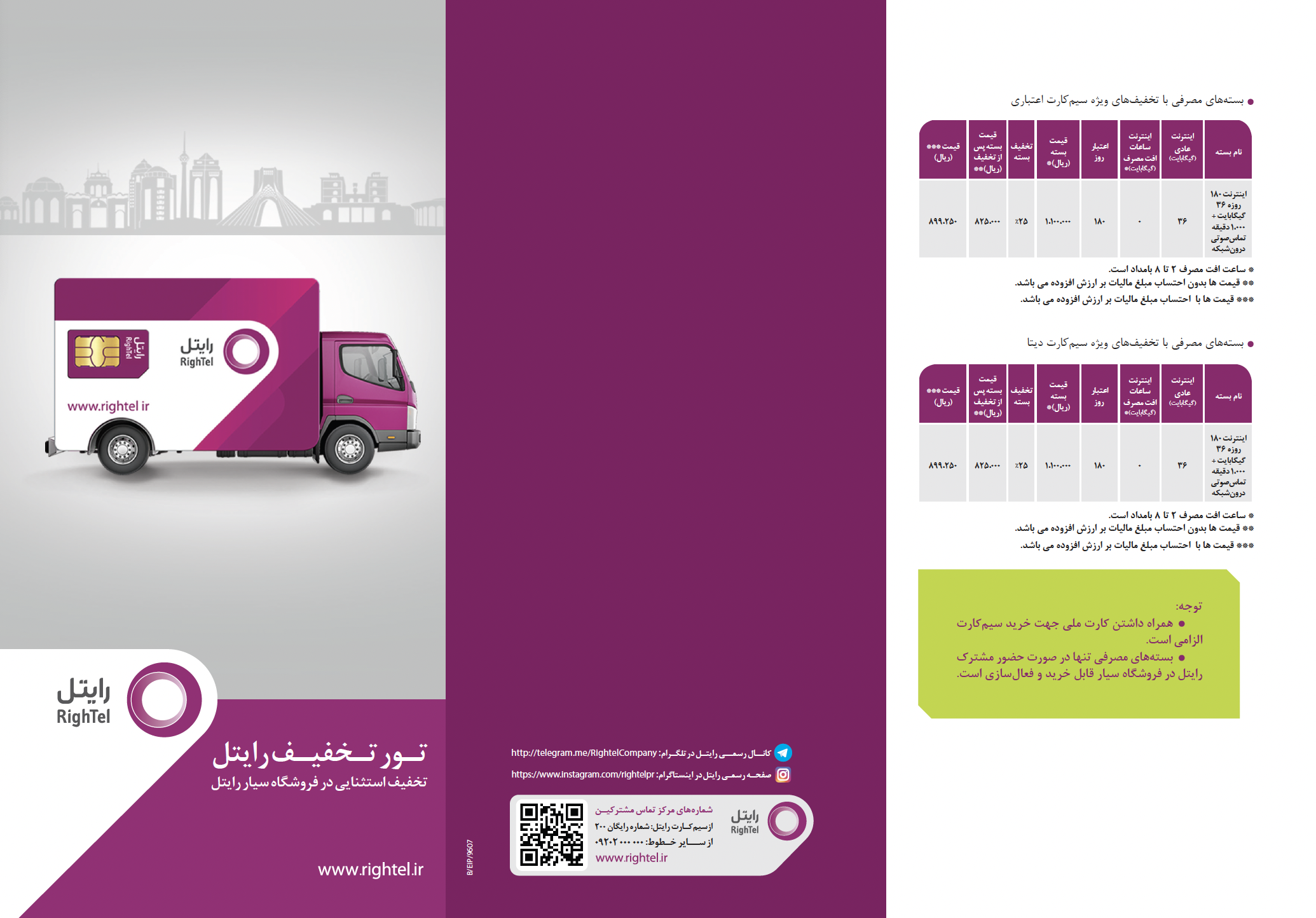
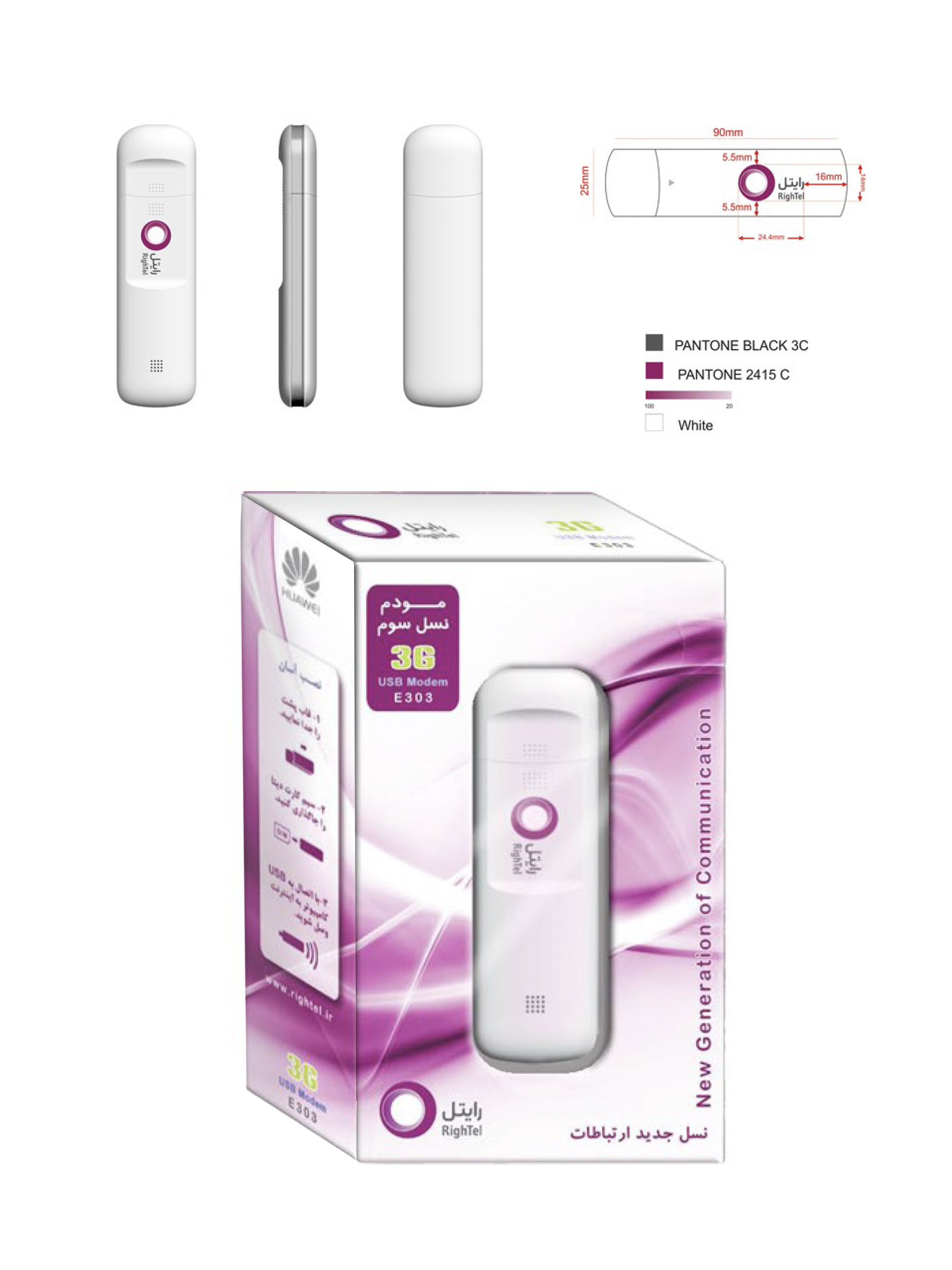
SIM Card & Packaging Design
The SIM card design follows Rightel's brand guidelines, incorporating the company's distinctive colors and visual elements. It ensures proper technical placement of the SIM chip, with designated spaces for essential details like the PIN, PUK codes, and mobile number. The design also complements the packaging, ensuring compatibility and a cohesive brand experience.
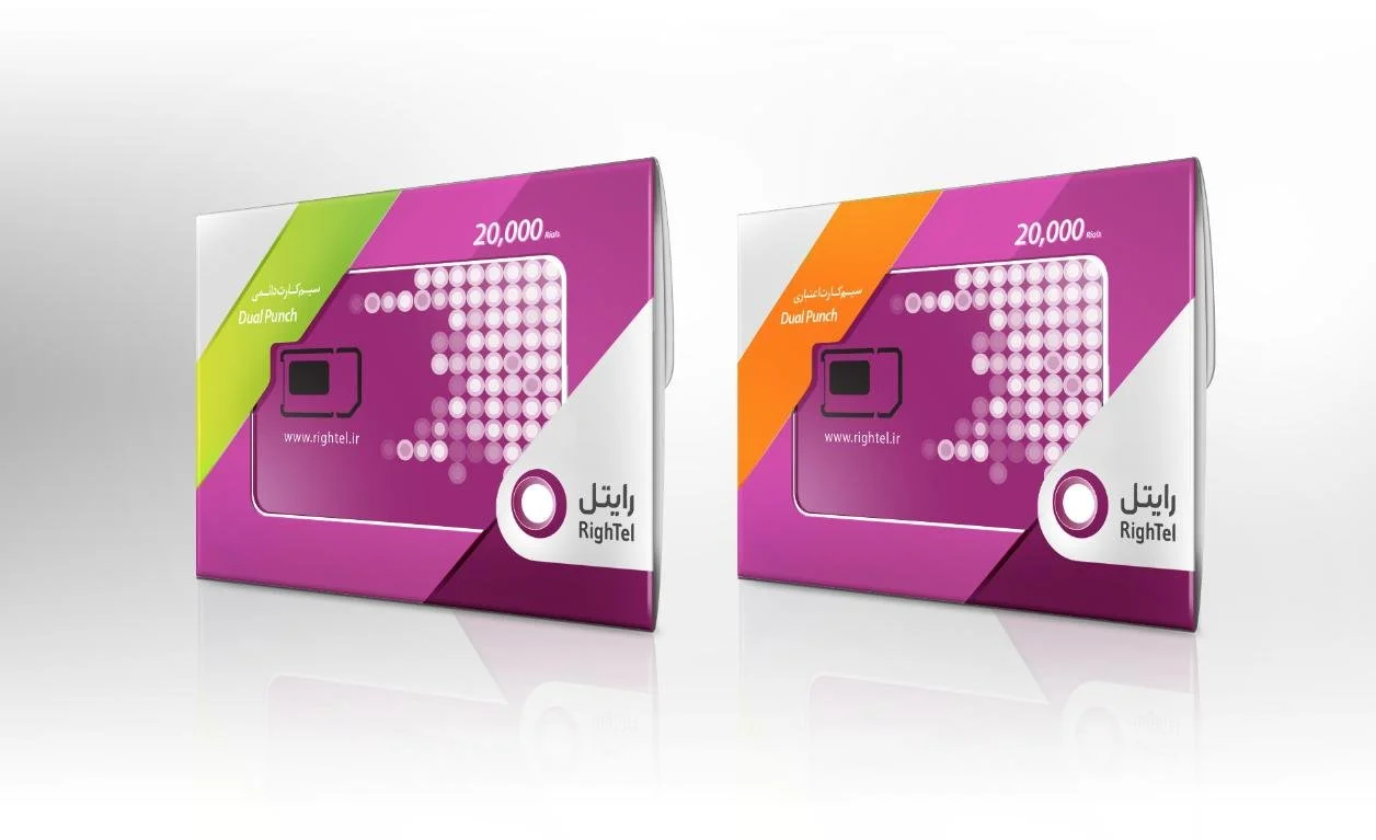
The SIM card pack is designed following the brand guidelines and SIM card specifications. It features a transparent window that allows the SIM card to be visible, enhancing user confidence by showcasing the product before unpacking. Key considerations include ensuring the appropriate size to fit within the retail environment and supply chain requirements, while maintaining visual appeal.
The packaging provides space for a small user guide or brochure on how to use the SIM card. Each pack is marked and categorized with distinct brand colors to differentiate between prepaid, postpaid, and data SIM cards, as well as SIM sizes (nano, micro, and standard). This design ensures both clarity and attractiveness, making the product easily identifiable and user-friendly
Brand team member / Graphic Designer / Brand Lead
Simcard / Package Design
2014-2015
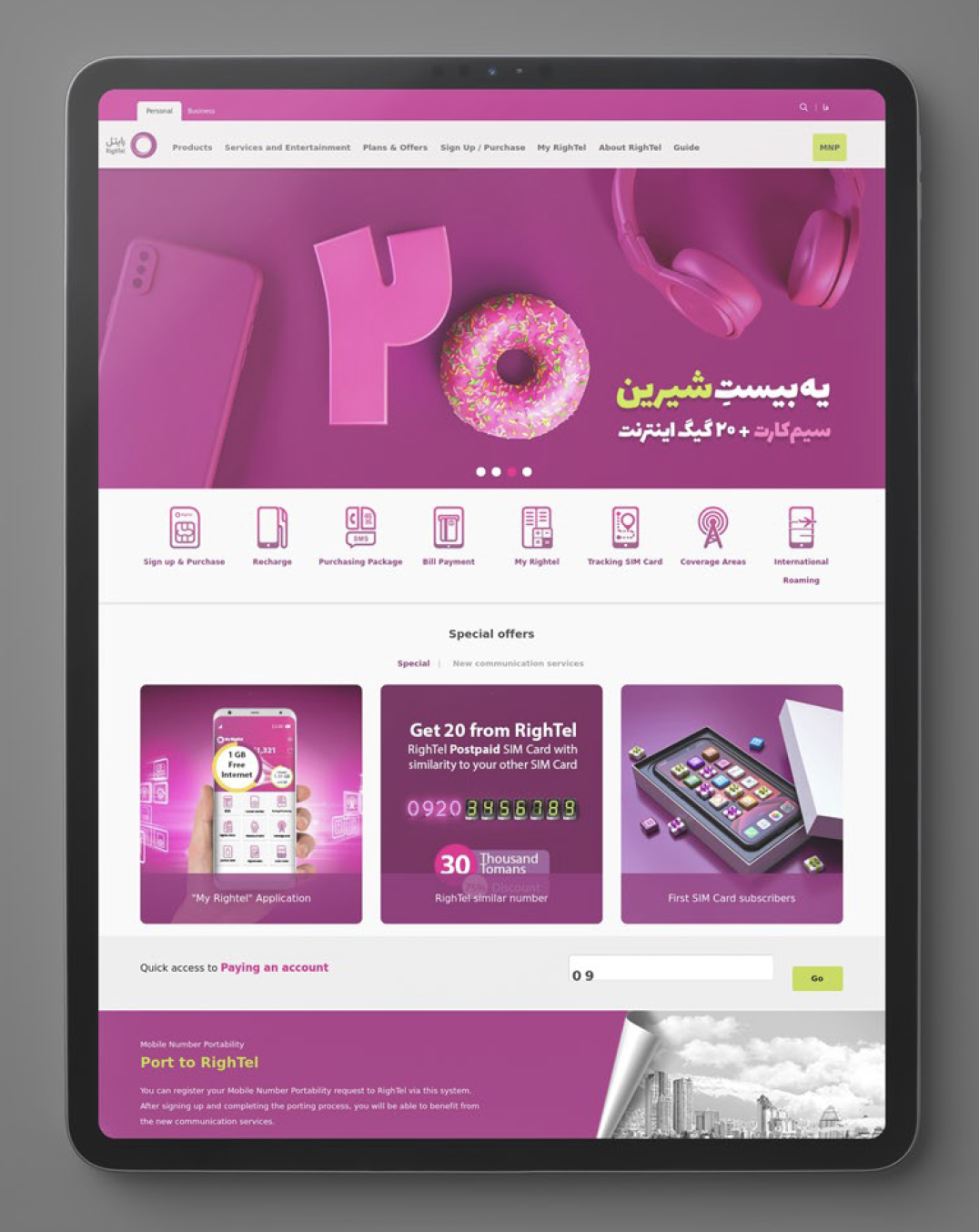
Other Brand Materials:
Brochure, Website, Poster, Billboard,…
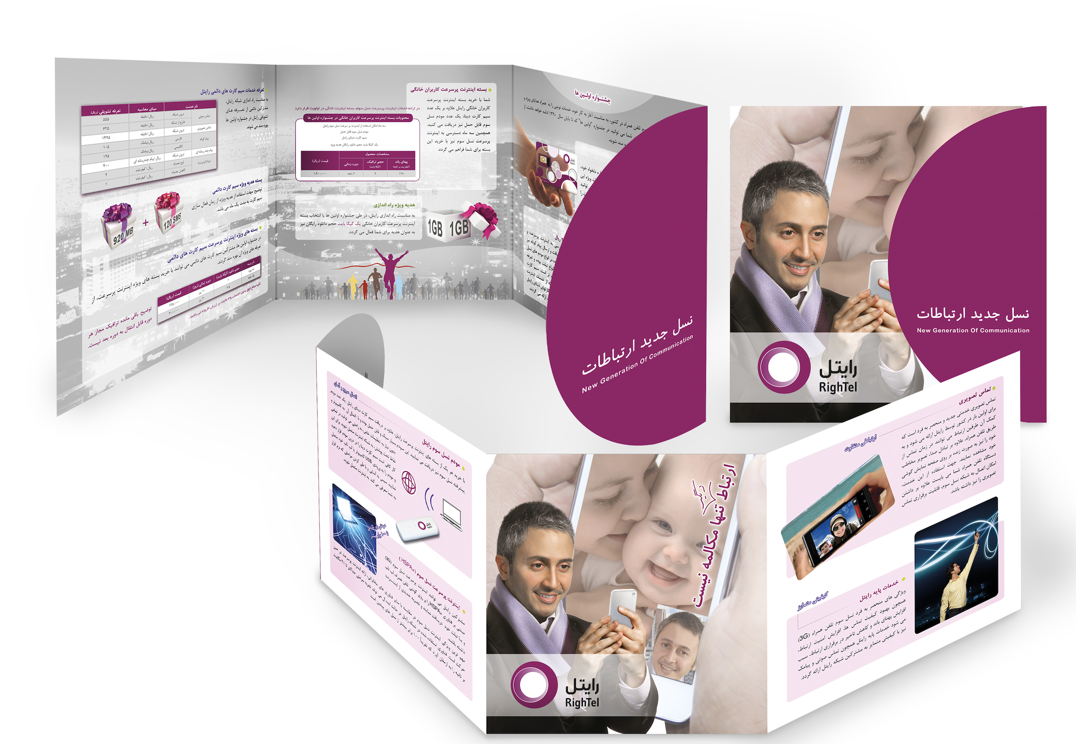
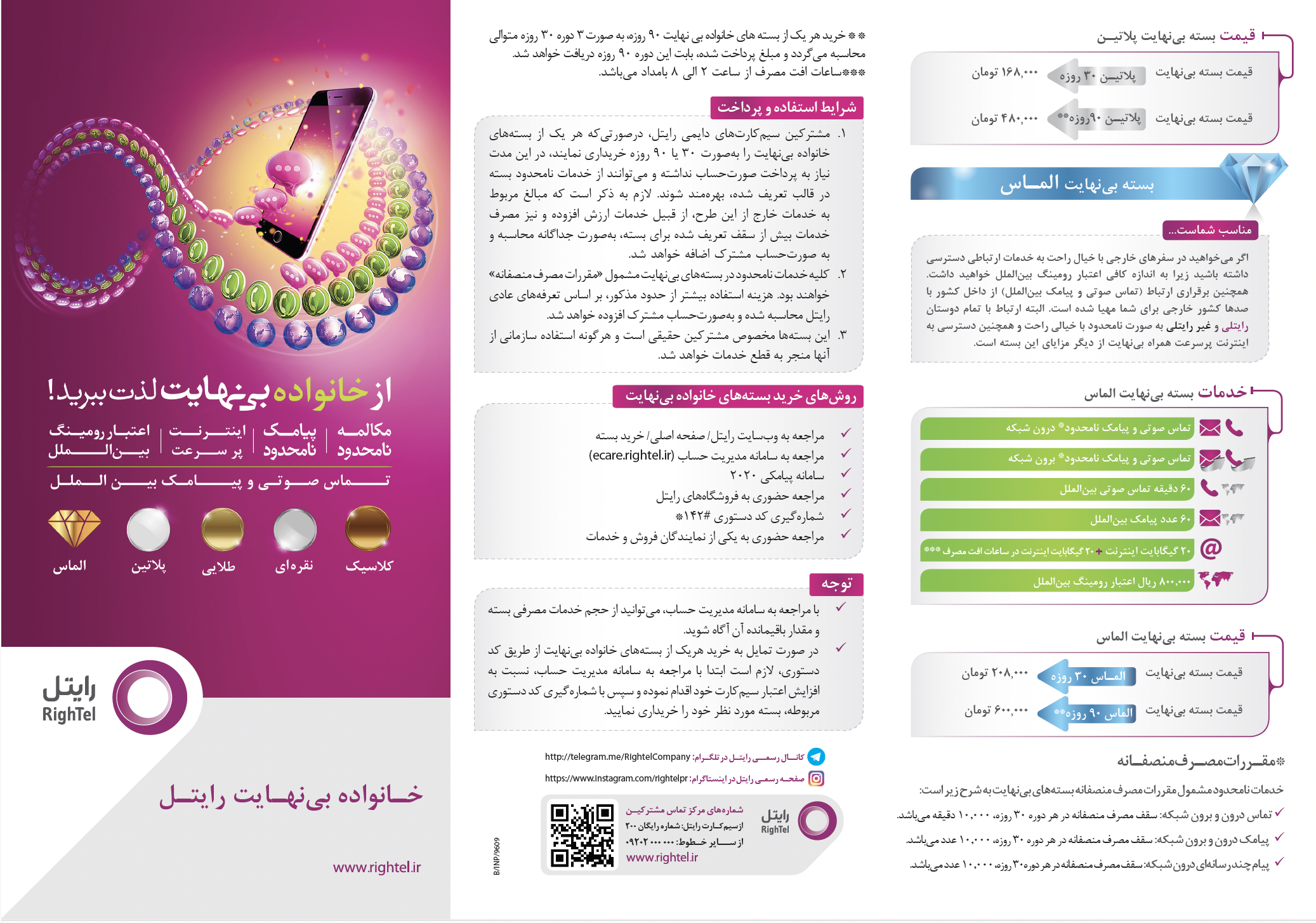
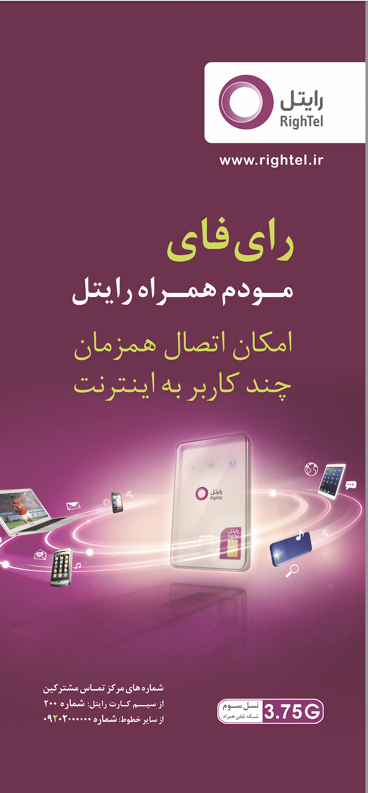
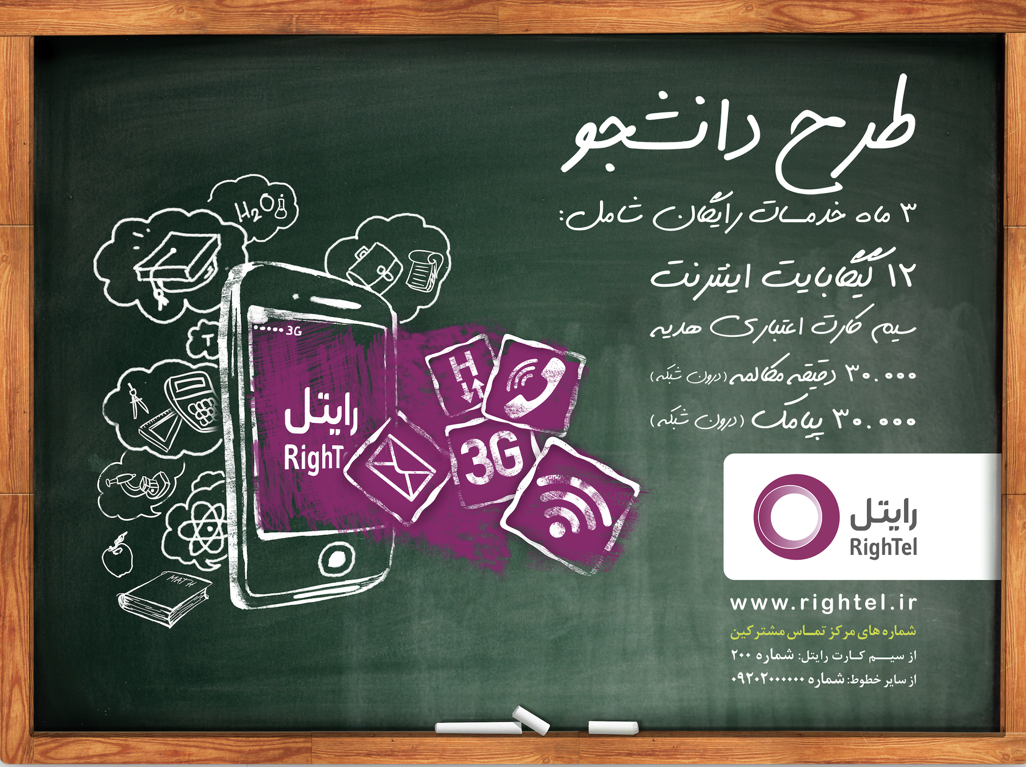
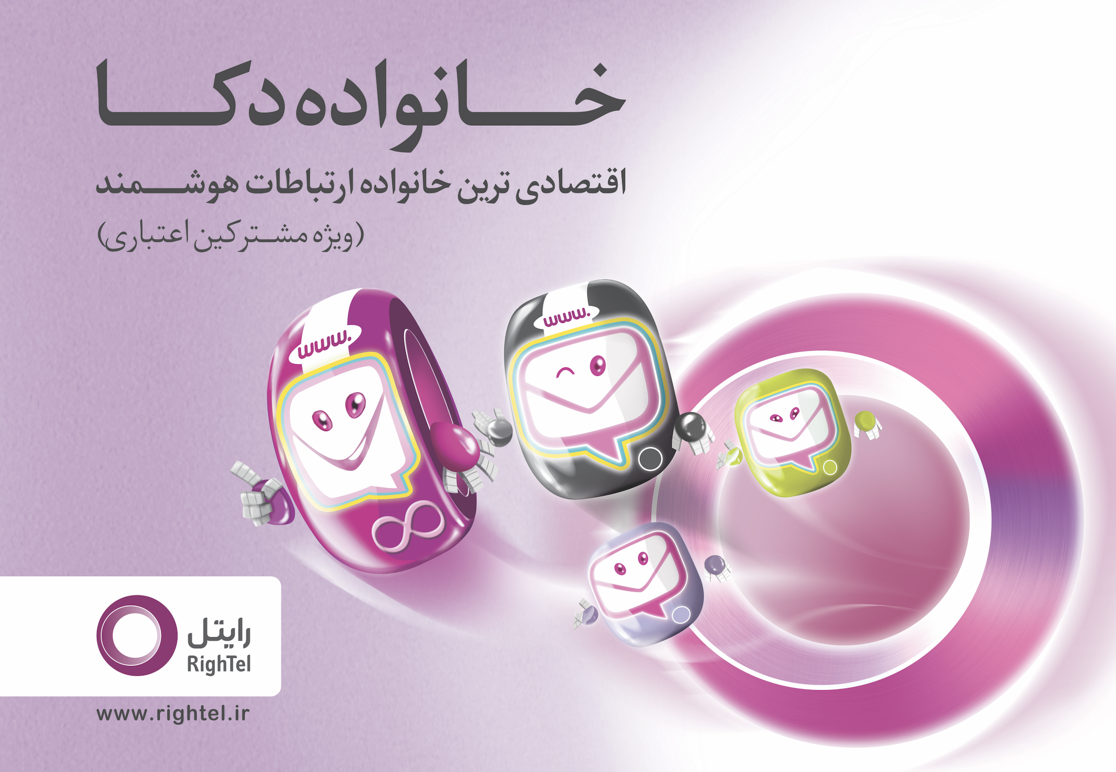
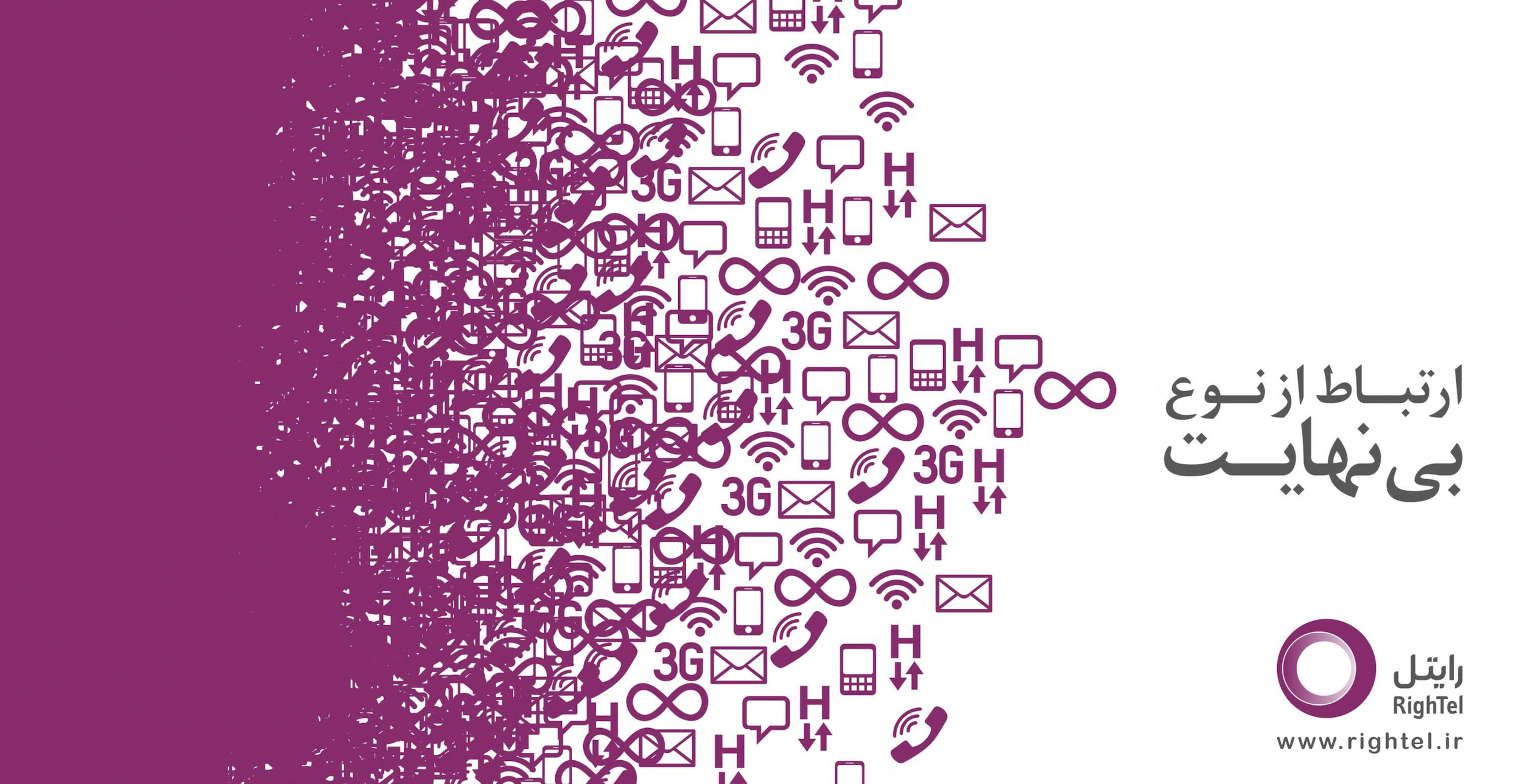
Brand team member / Graphic Designer/ Concept Ideator / Creative Lead
Bruchure, Packaging, Poster Design/ Ad campaign and Branding
2015-2017
Branding in Exhibition & Service Centers
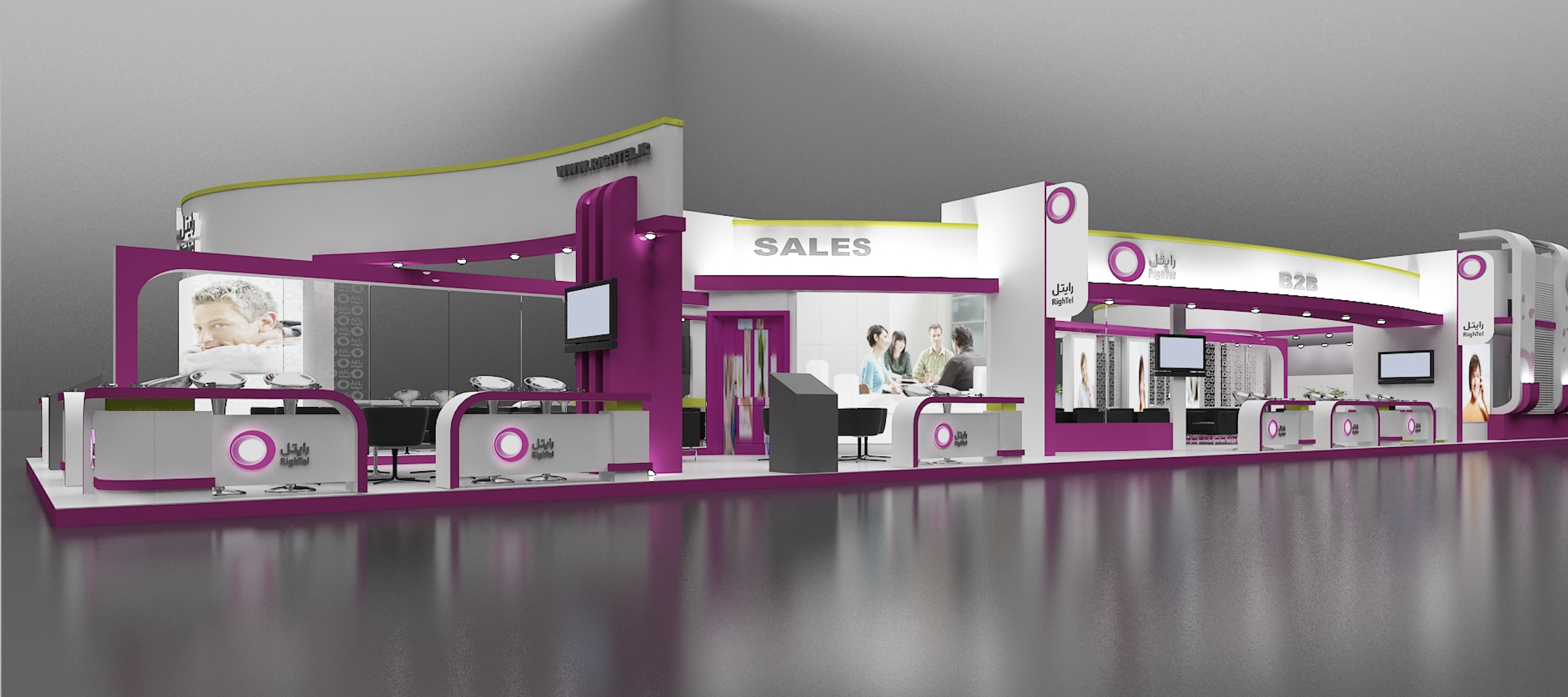
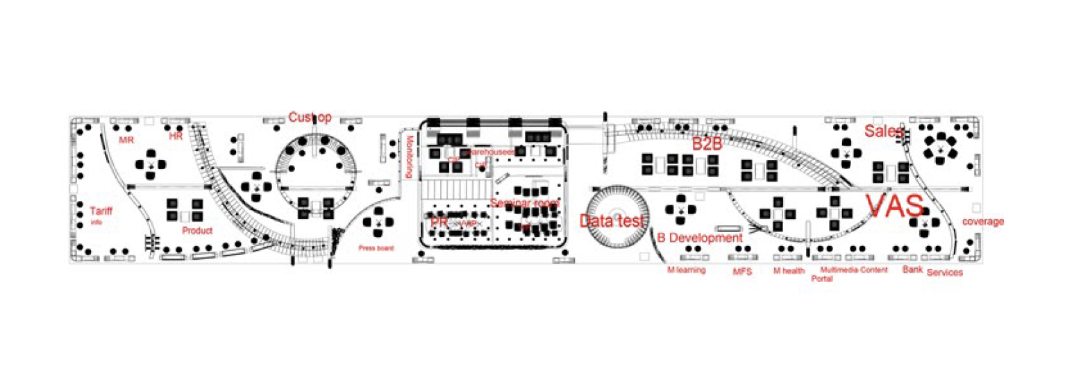
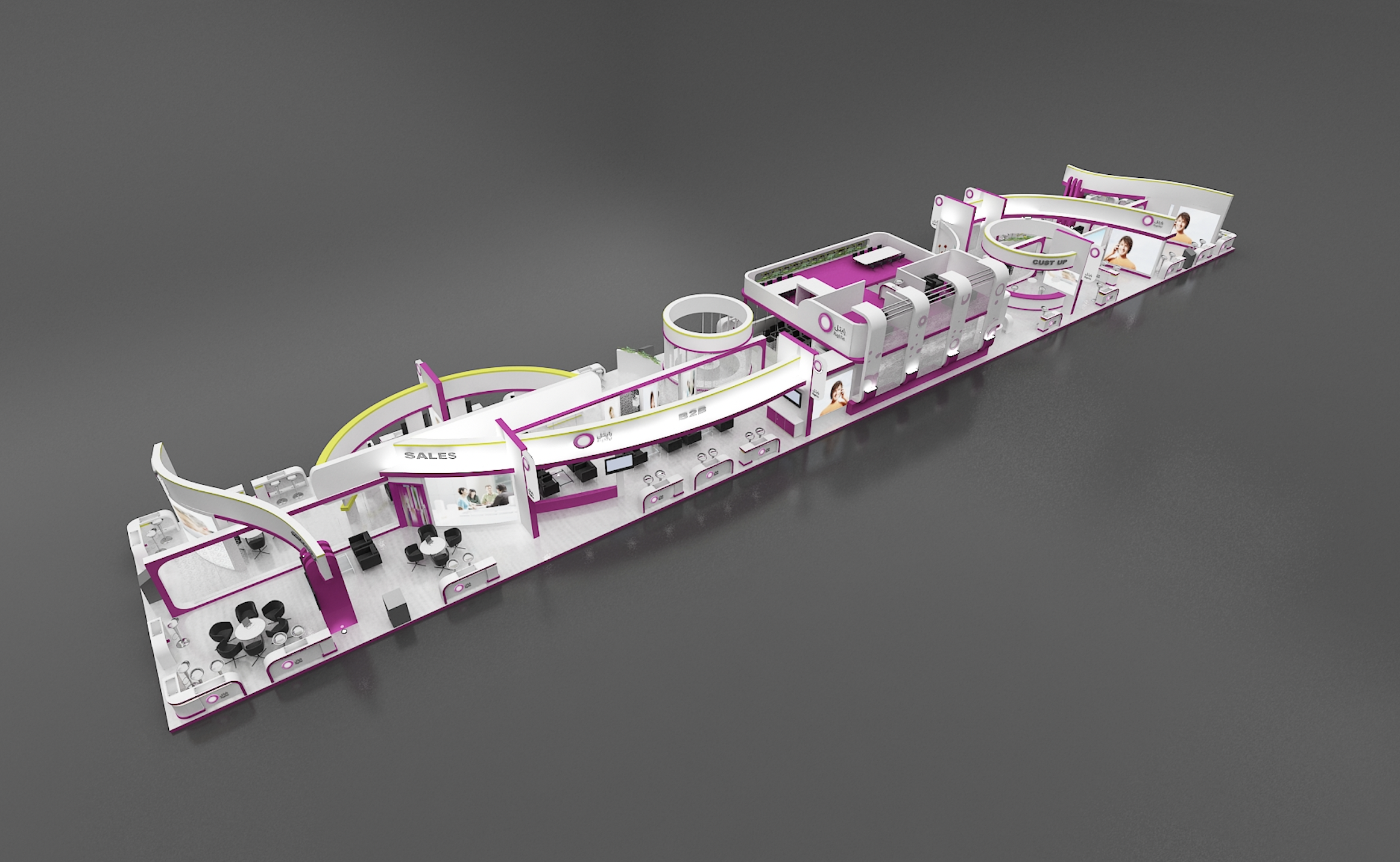

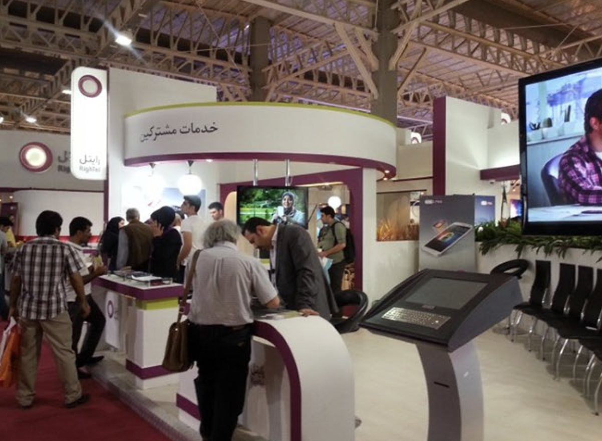
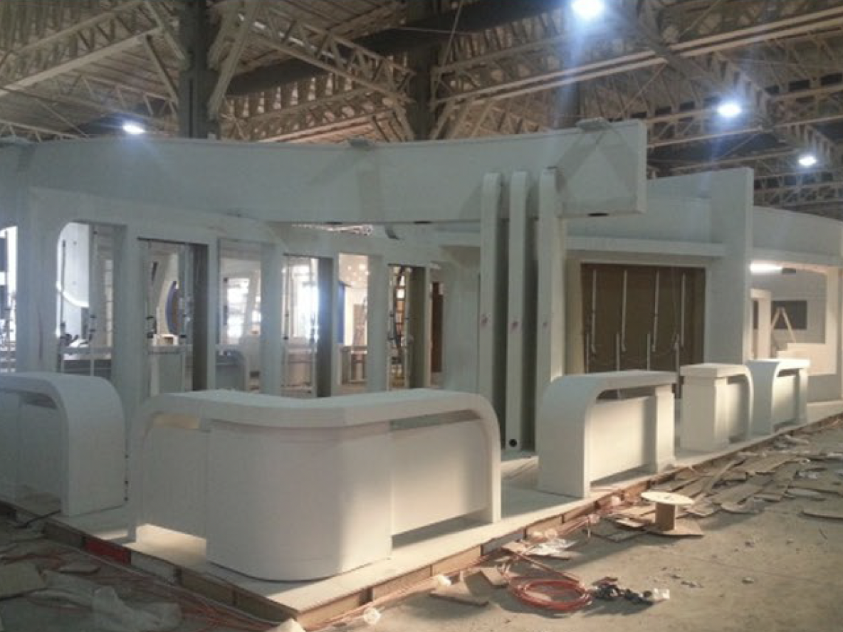
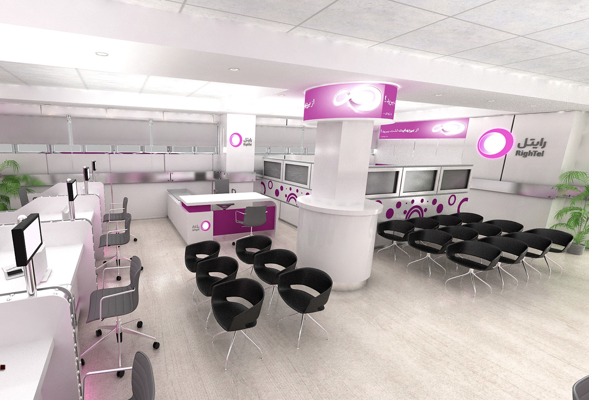
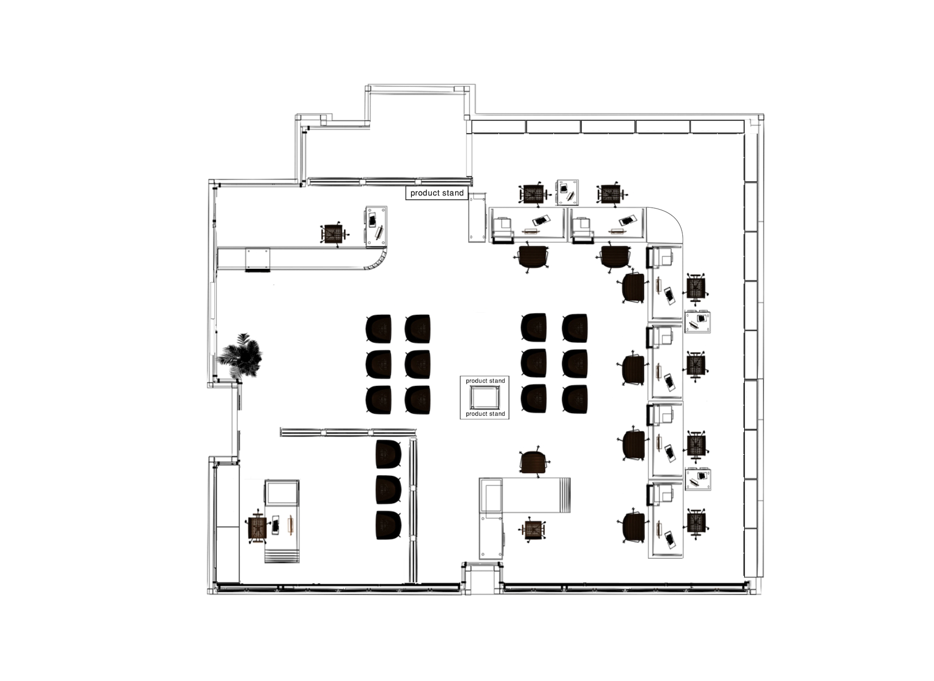
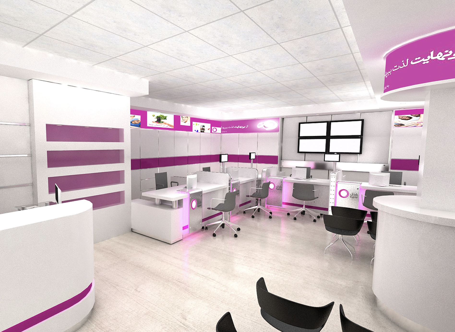
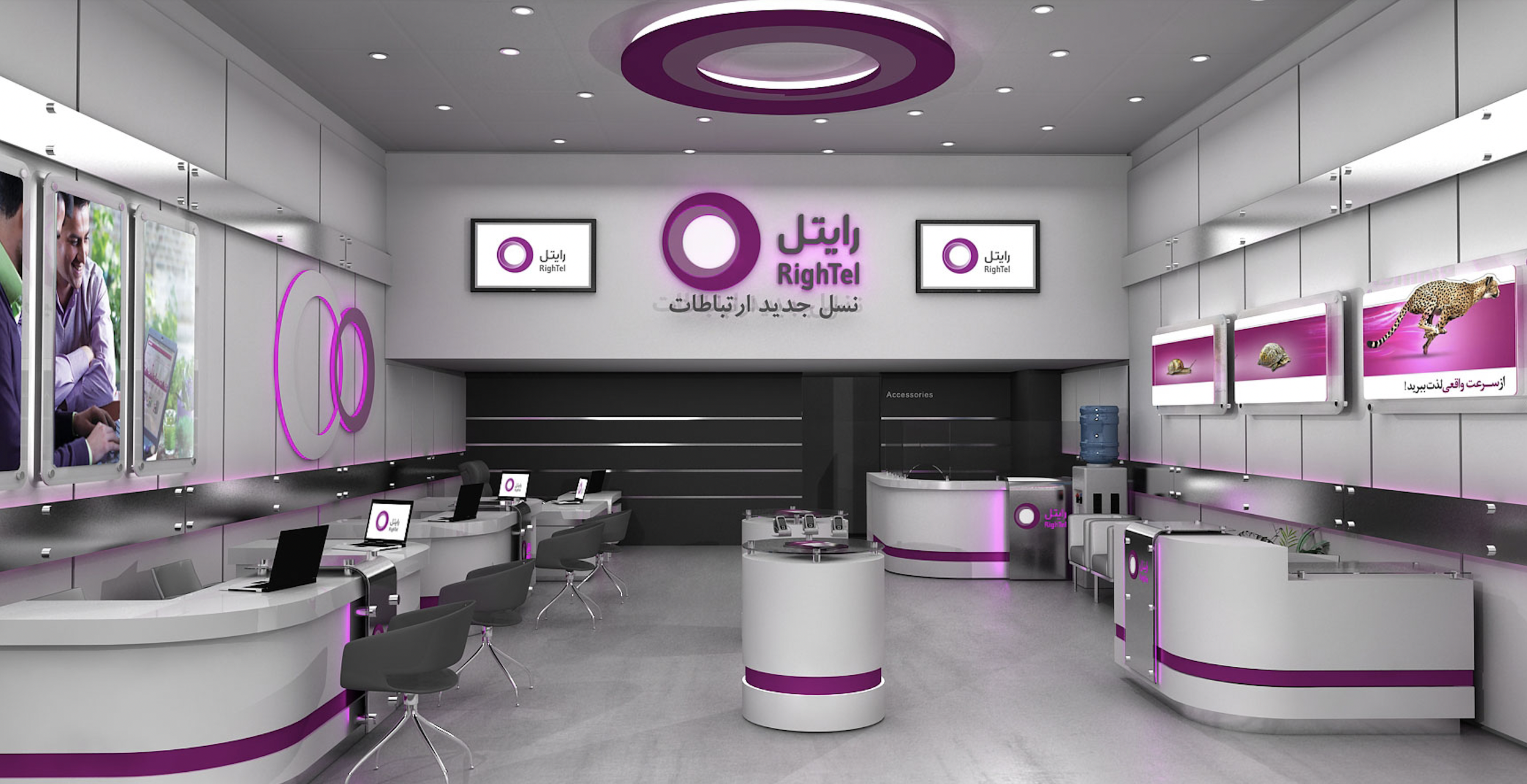
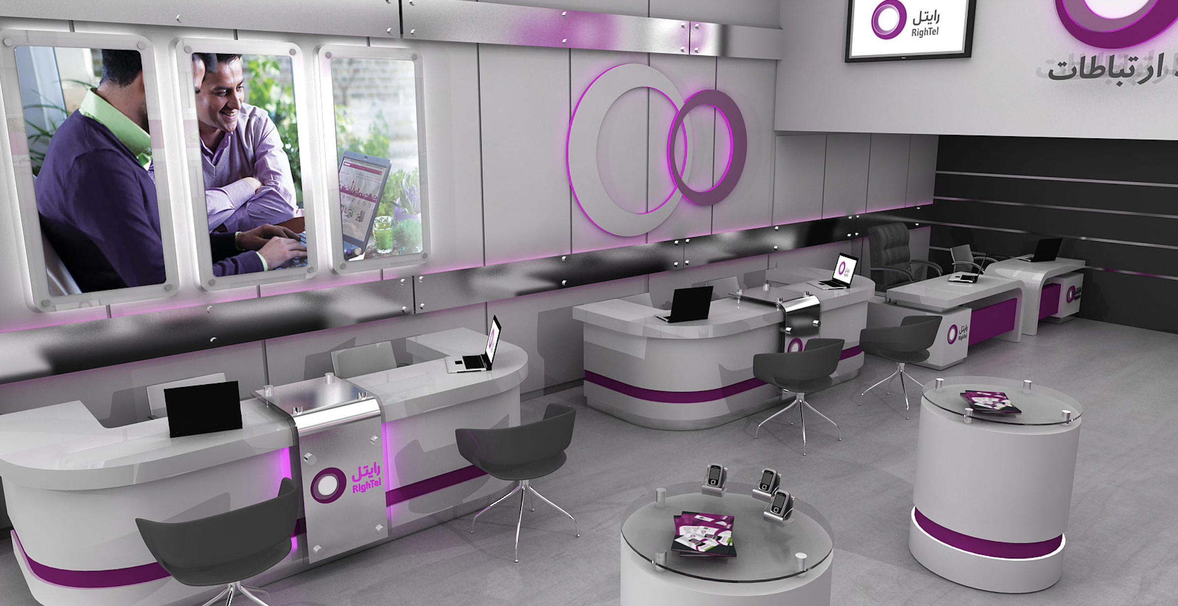
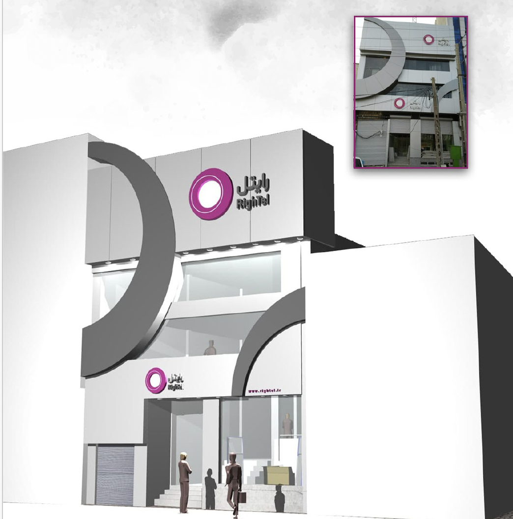
Brand Team Member / Concept & Plan designer / Design Lead / Brand Lead
Booth Design (Telecom Fair), Shop Design (Two different store branches)
2015-2017
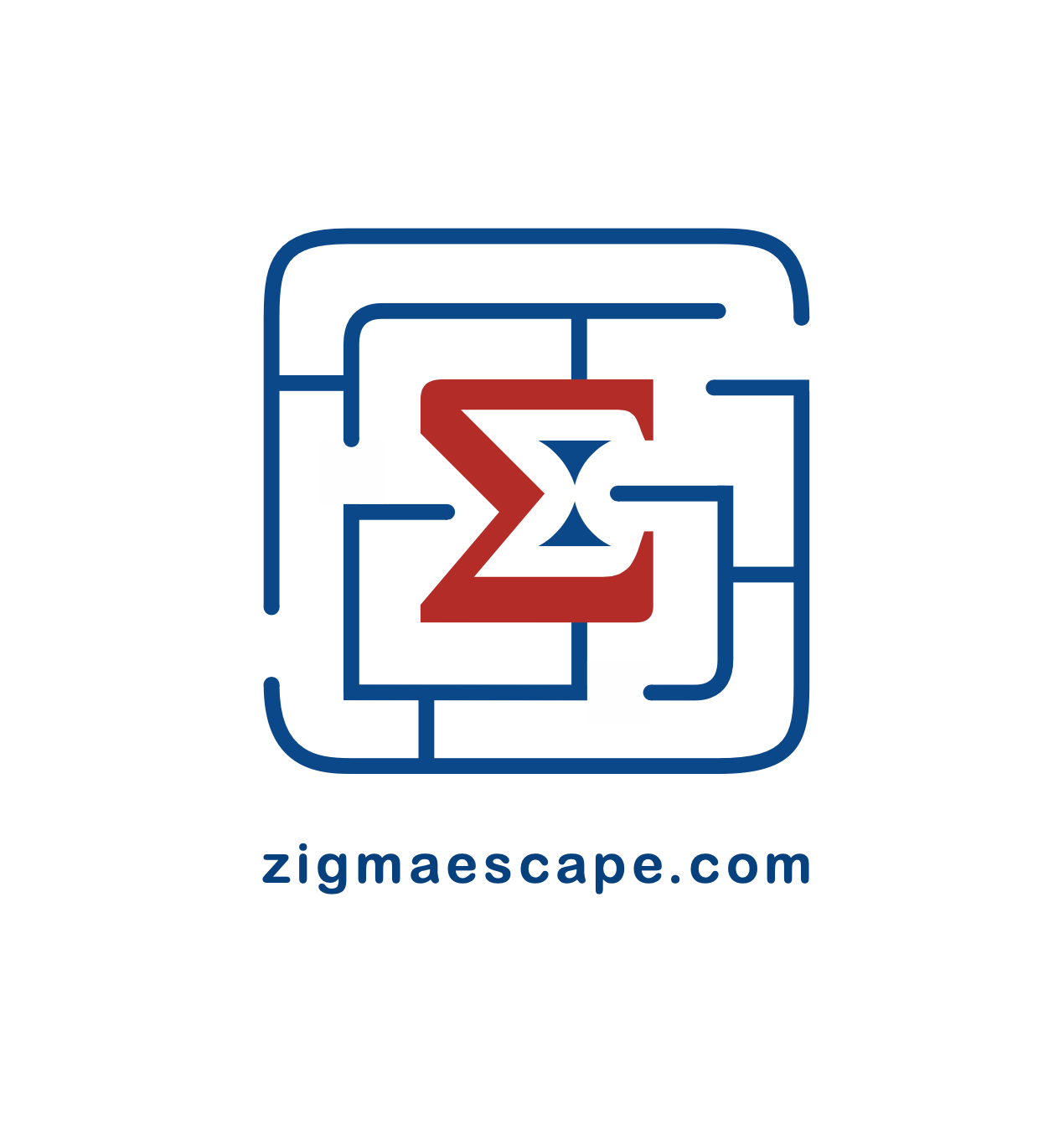
Escape Room Pre-Game Lounge - Zigma
Brand Identity & Design Thinking
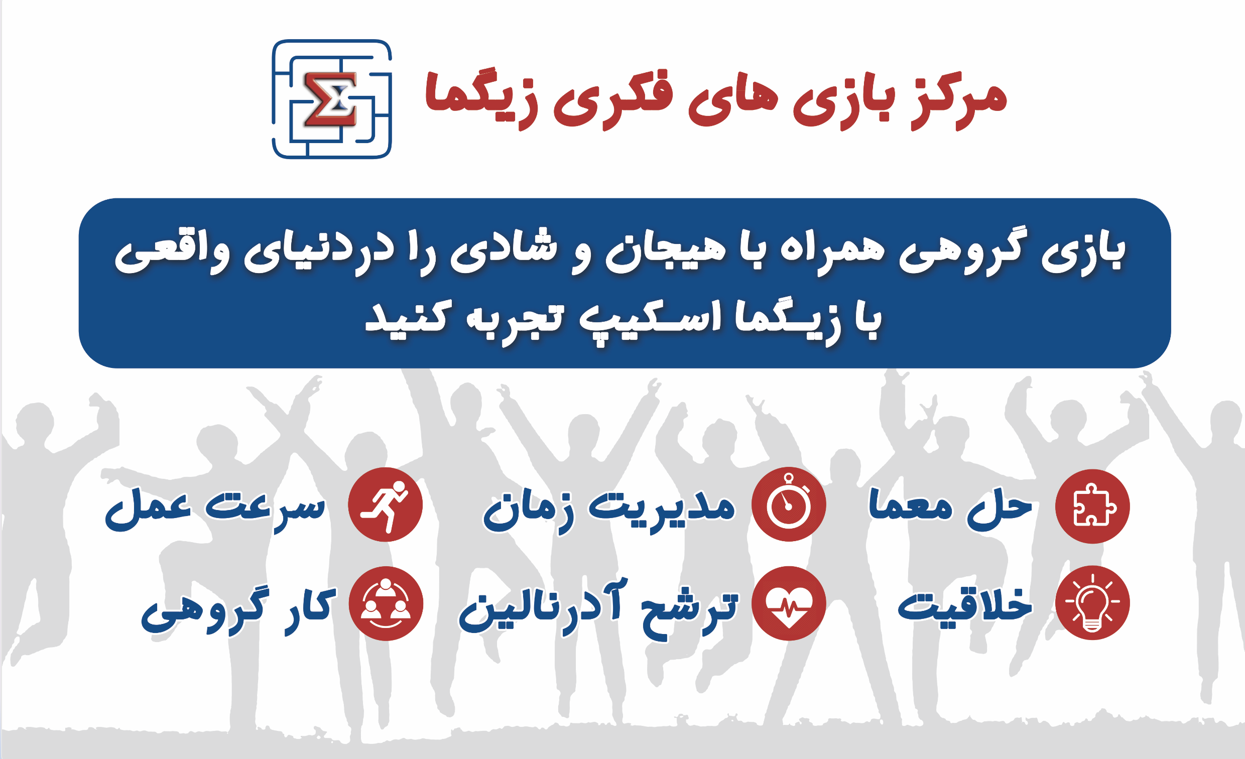
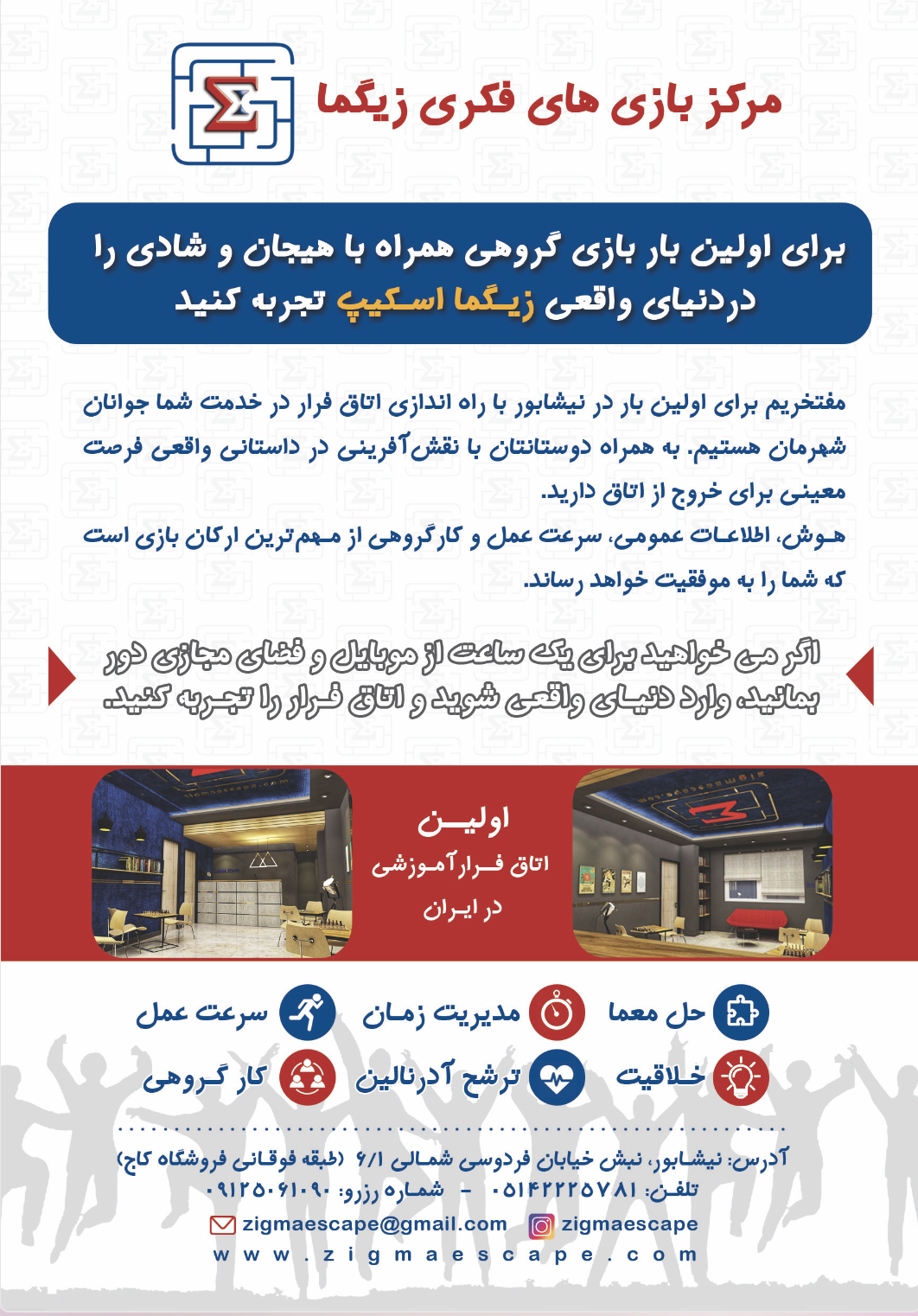
Zigma wasn't just a game room—it was an immersive experience designed for adventurers aged 14 and above. As a family business, we created a space that catered to all, featuring both escape rooms and a game board area. Upon entering, guests were greeted by a vibrant waiting area adorned with tables for game boarding, shelves filled with intriguing games, an information counter and the back technical space for the escape rooms.
The highlight of Zigma lay in its two unique escape rooms, each with its own captivating storyline waiting to be unraveled. From deciphering puzzles to overcoming challenges, groups had to work together within a limited time frame to emerge victorious and exit the room triumphantly.
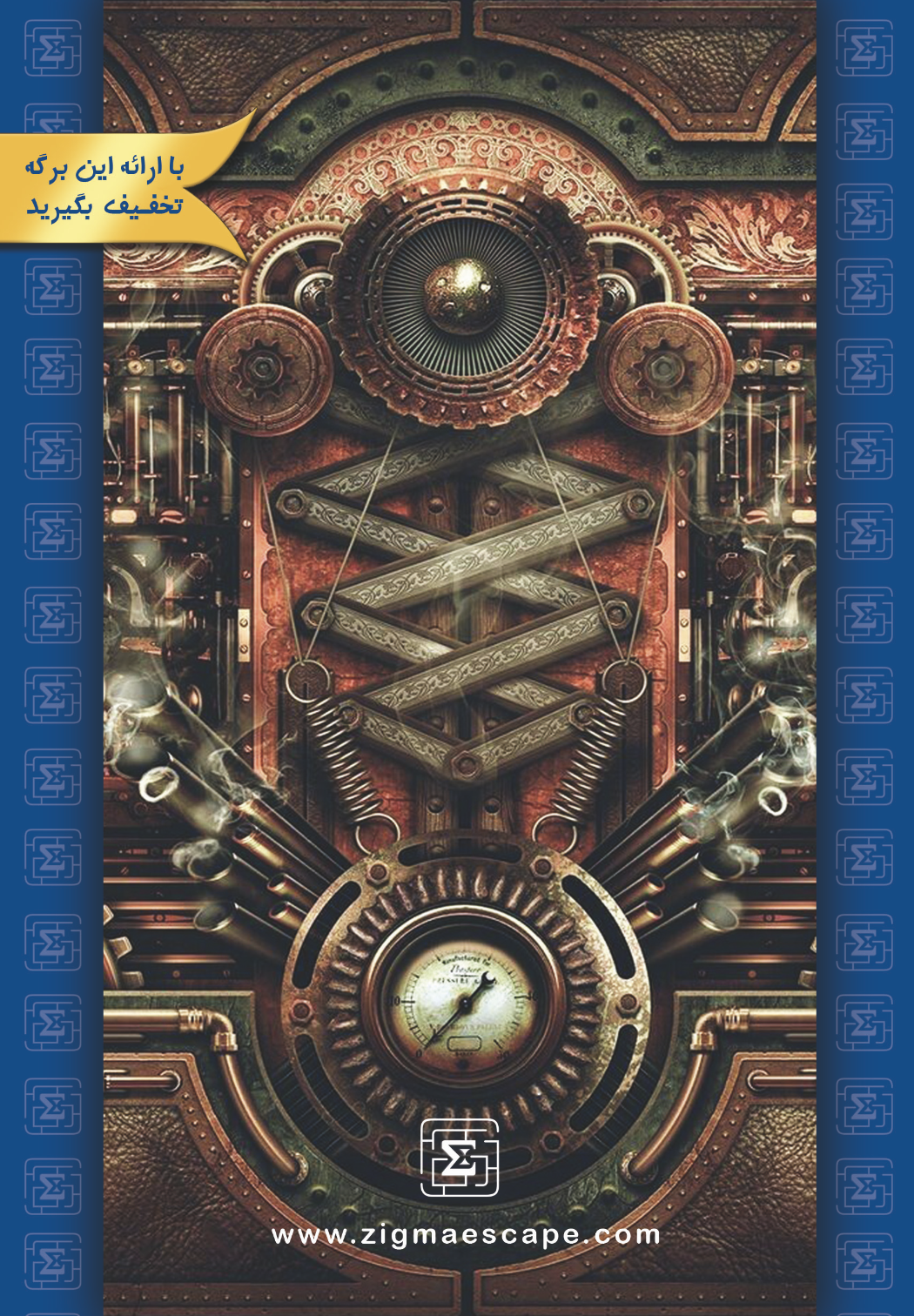
Inspired by the mathematical sigma symbol, Zigma's branding revolved around the concept of navigating through complex mazes and puzzles. Our dynamic colors conveyed a sense of activity, excitement, and movement, setting the stage for an unforgettable adventure. The entrance space, featuring our iconic backlit logo on the ceiling, instantly captivated visitors and drew them into our world of mystery.
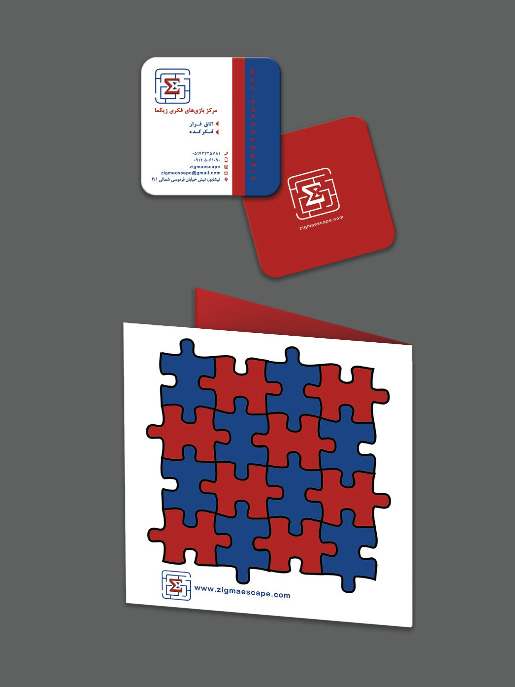
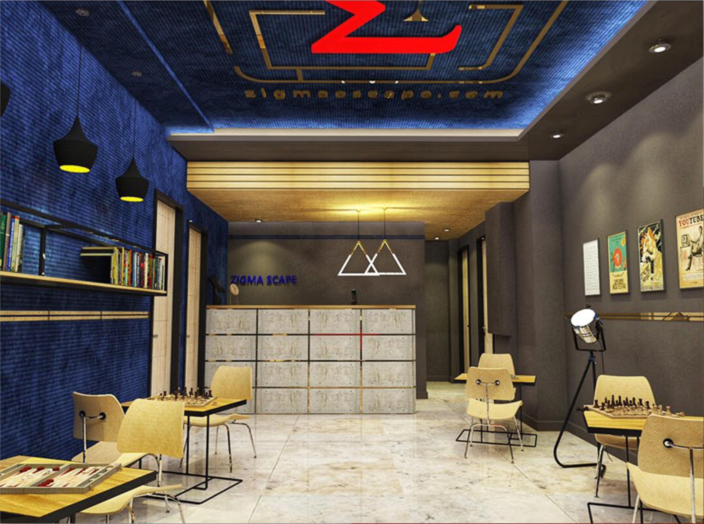
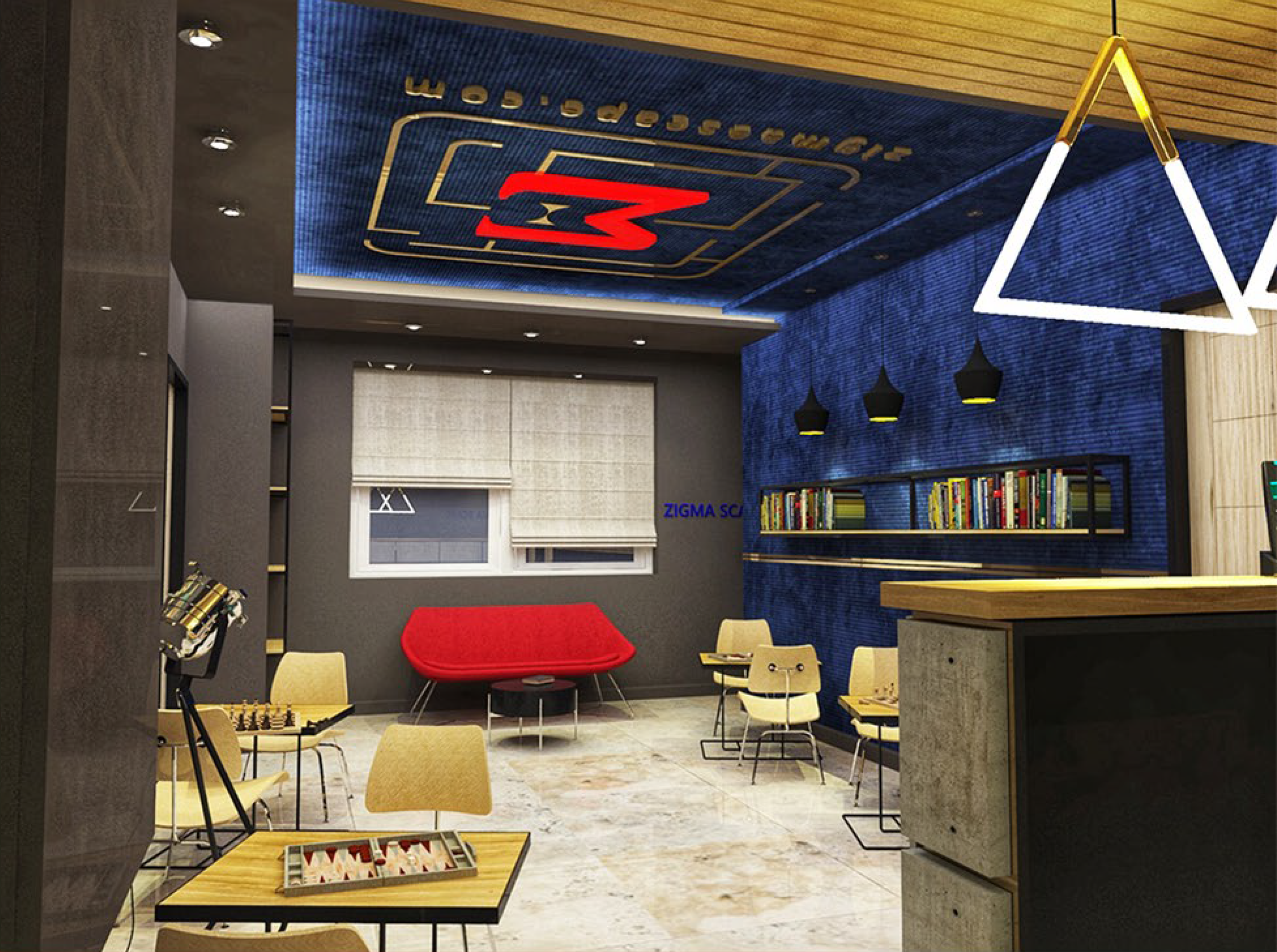
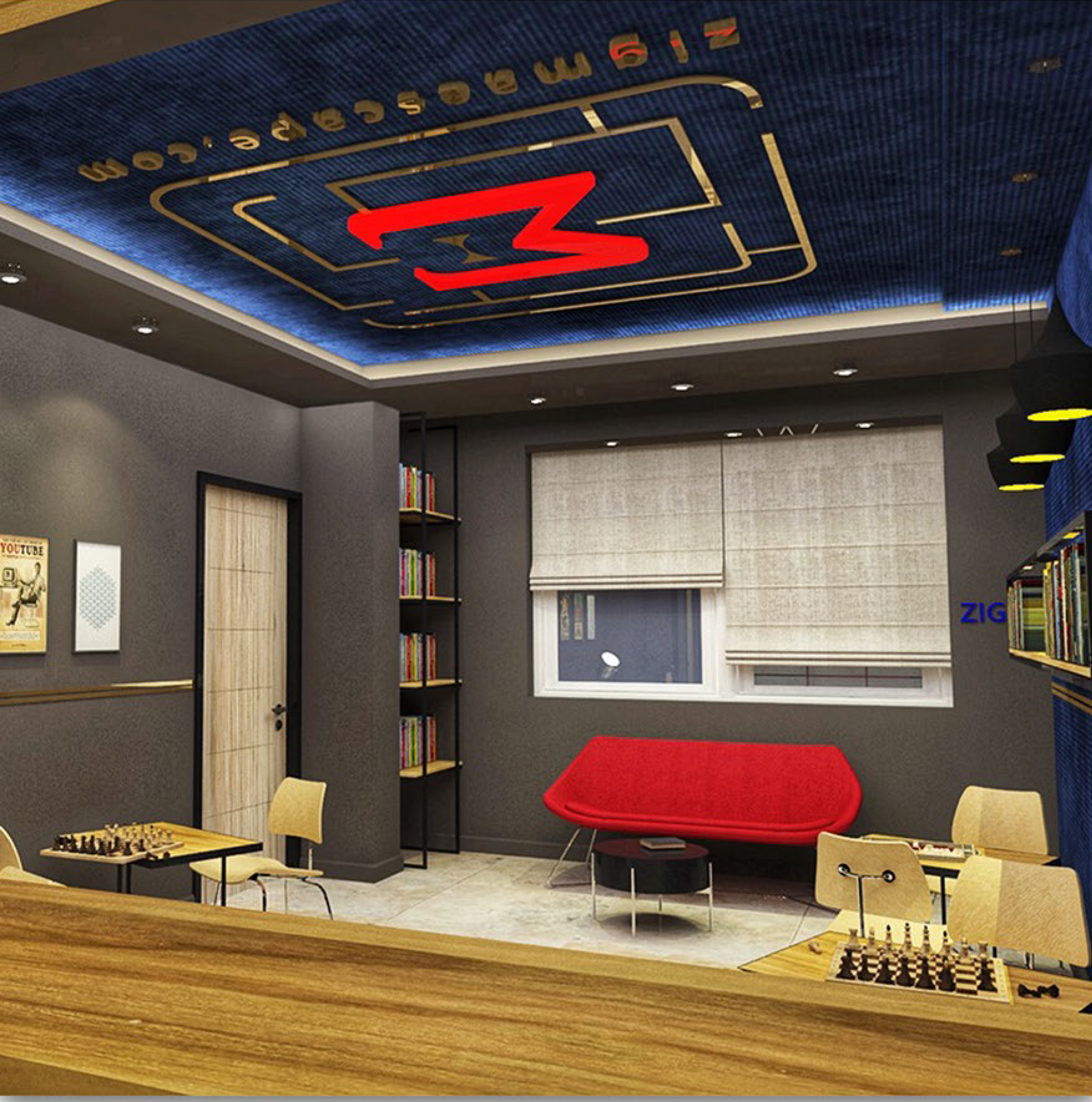
Zigma Game Room
BI Designer / Design Lead
Waiting Room of Scaperoom, BTL material
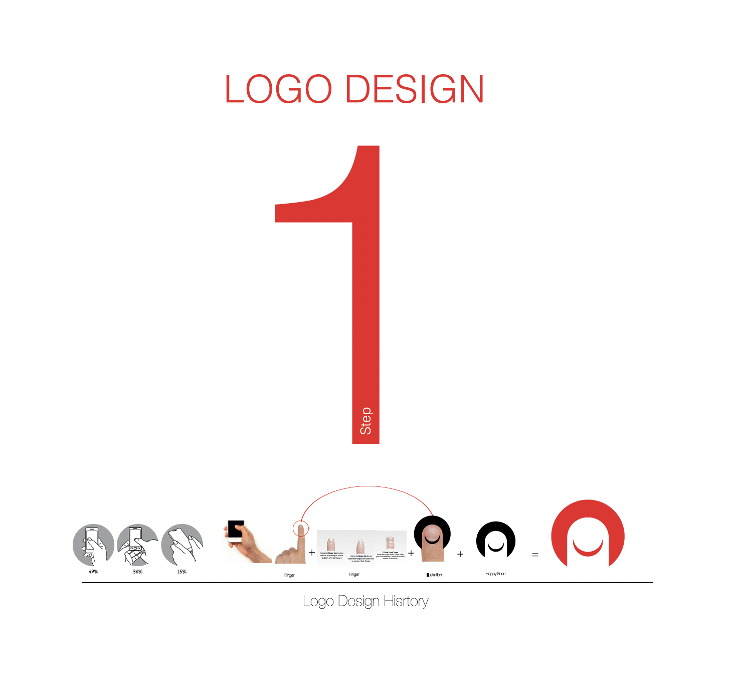
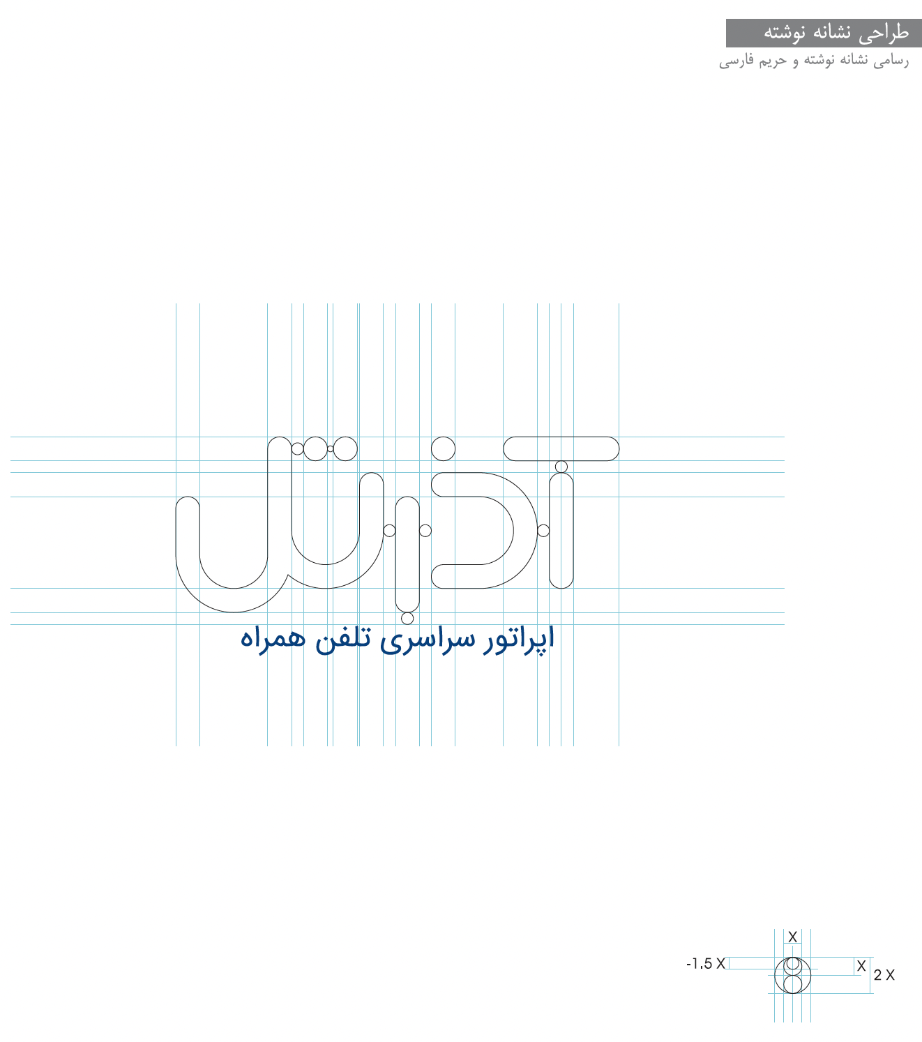
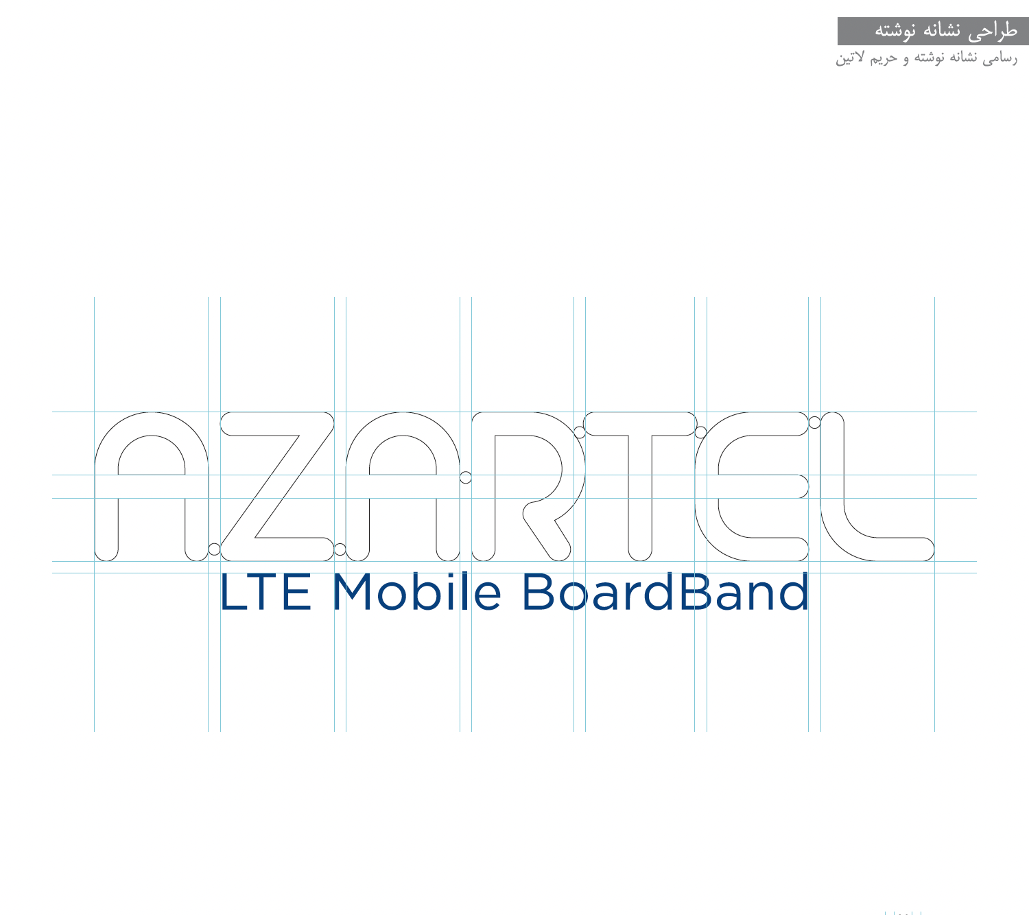
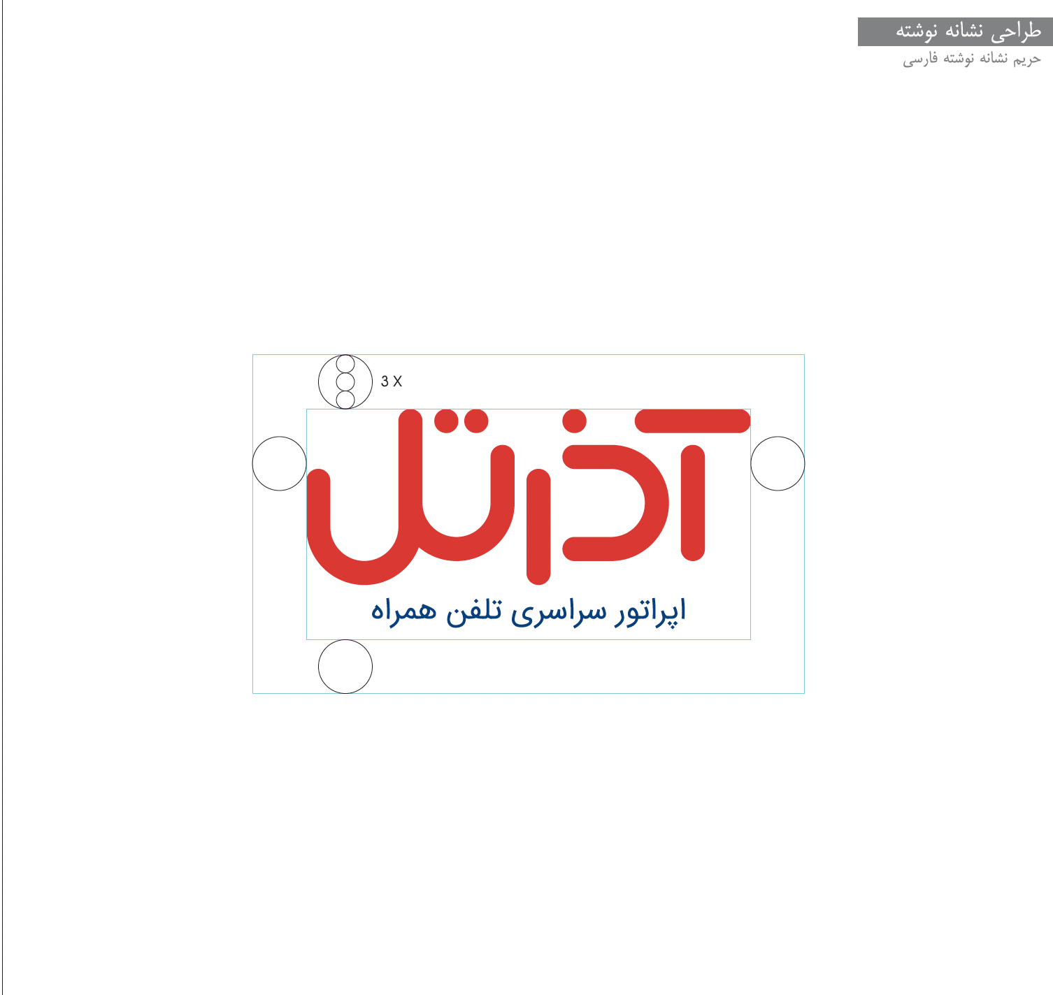
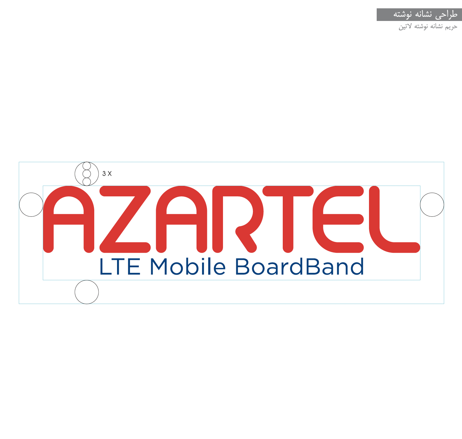
Telecom Company (MVMO) - AZARTEL
Brand Identity & Brand Strategy
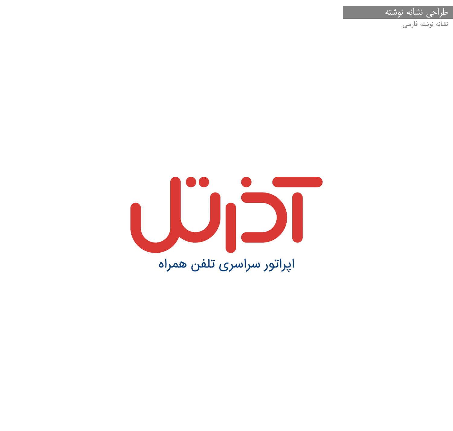
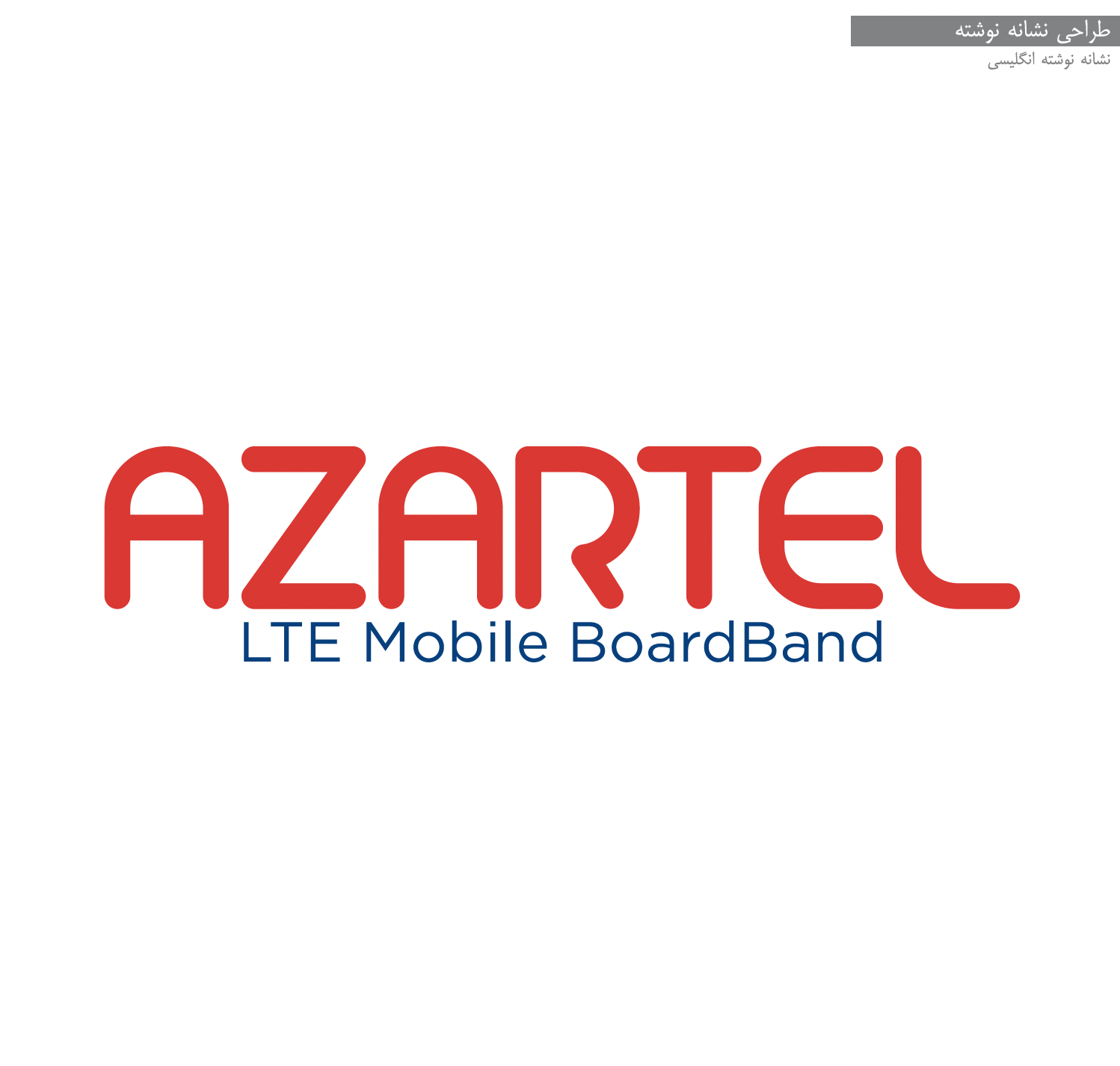
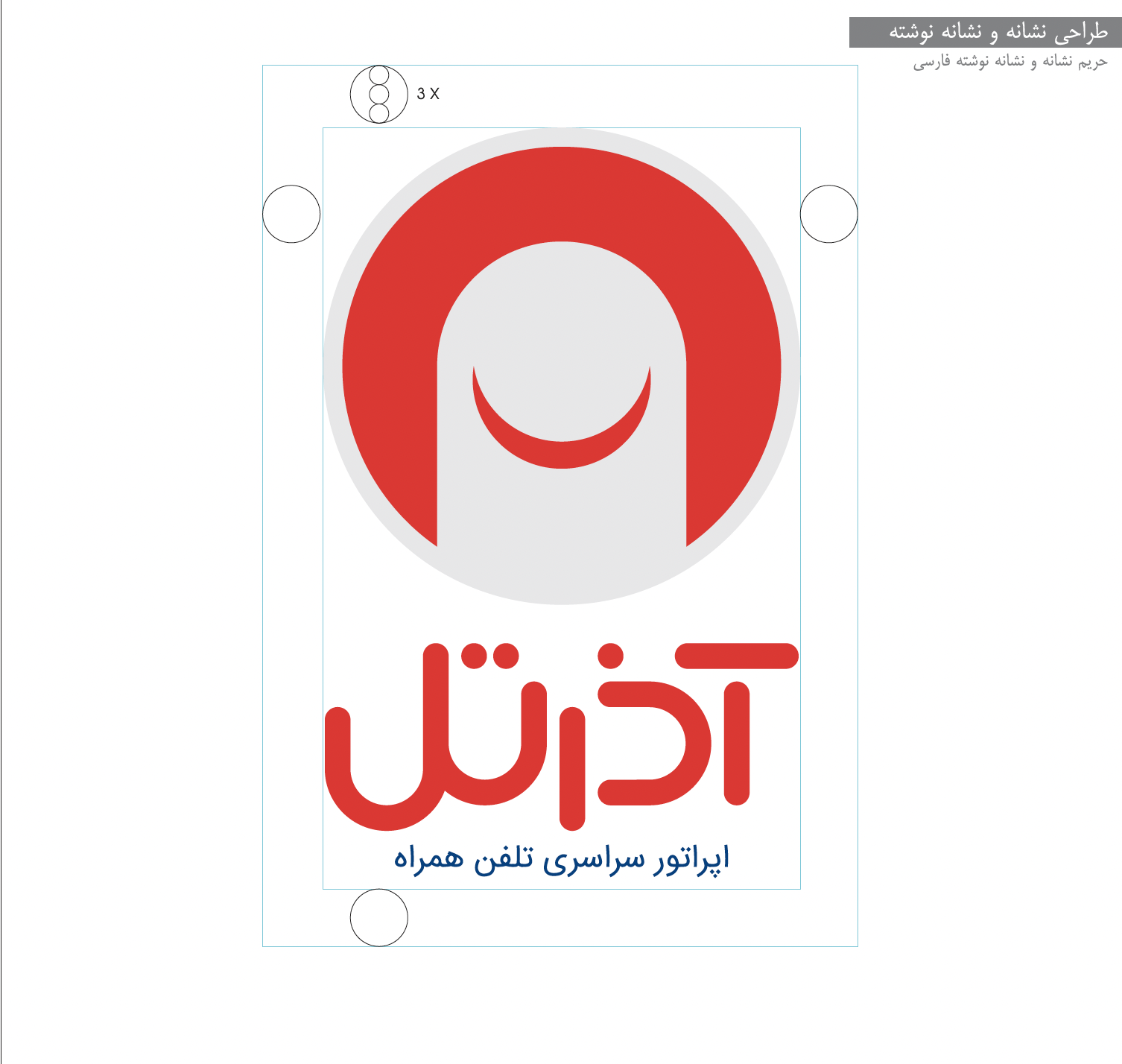
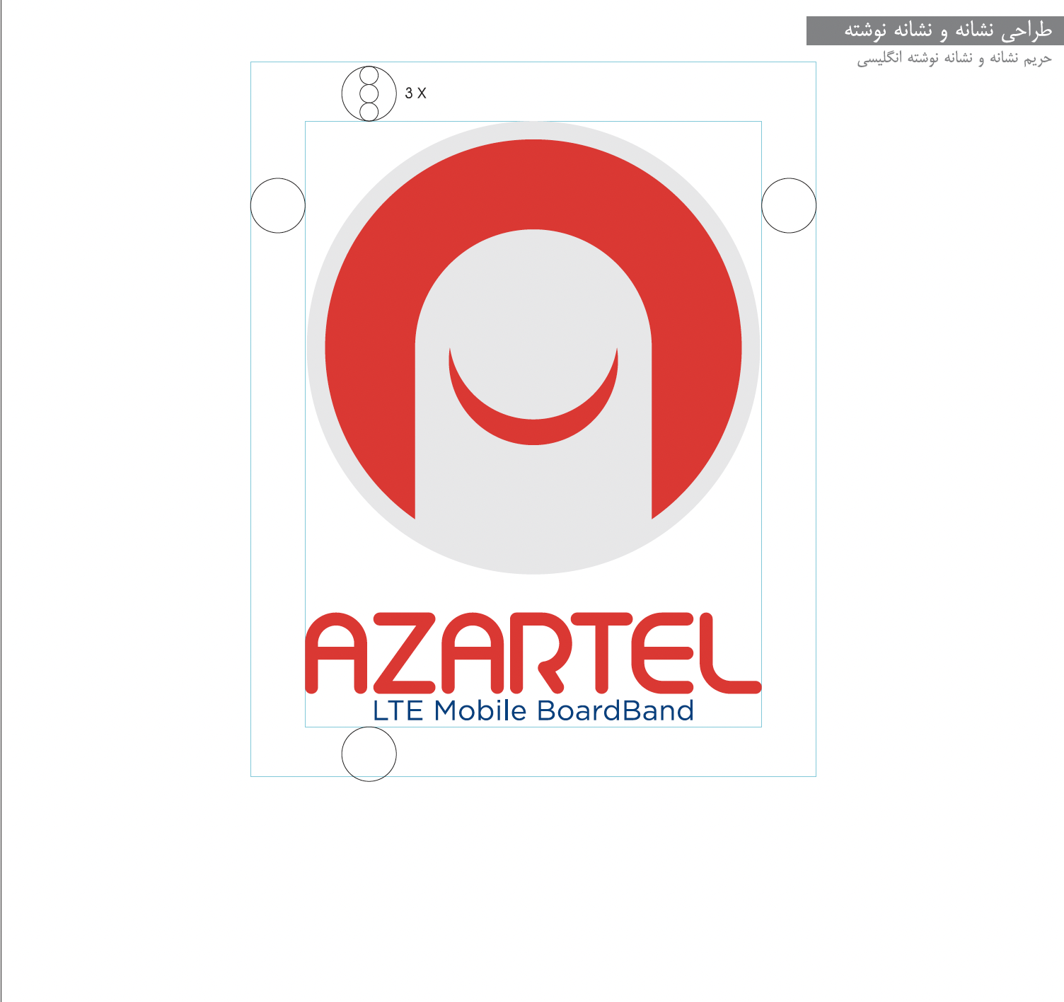
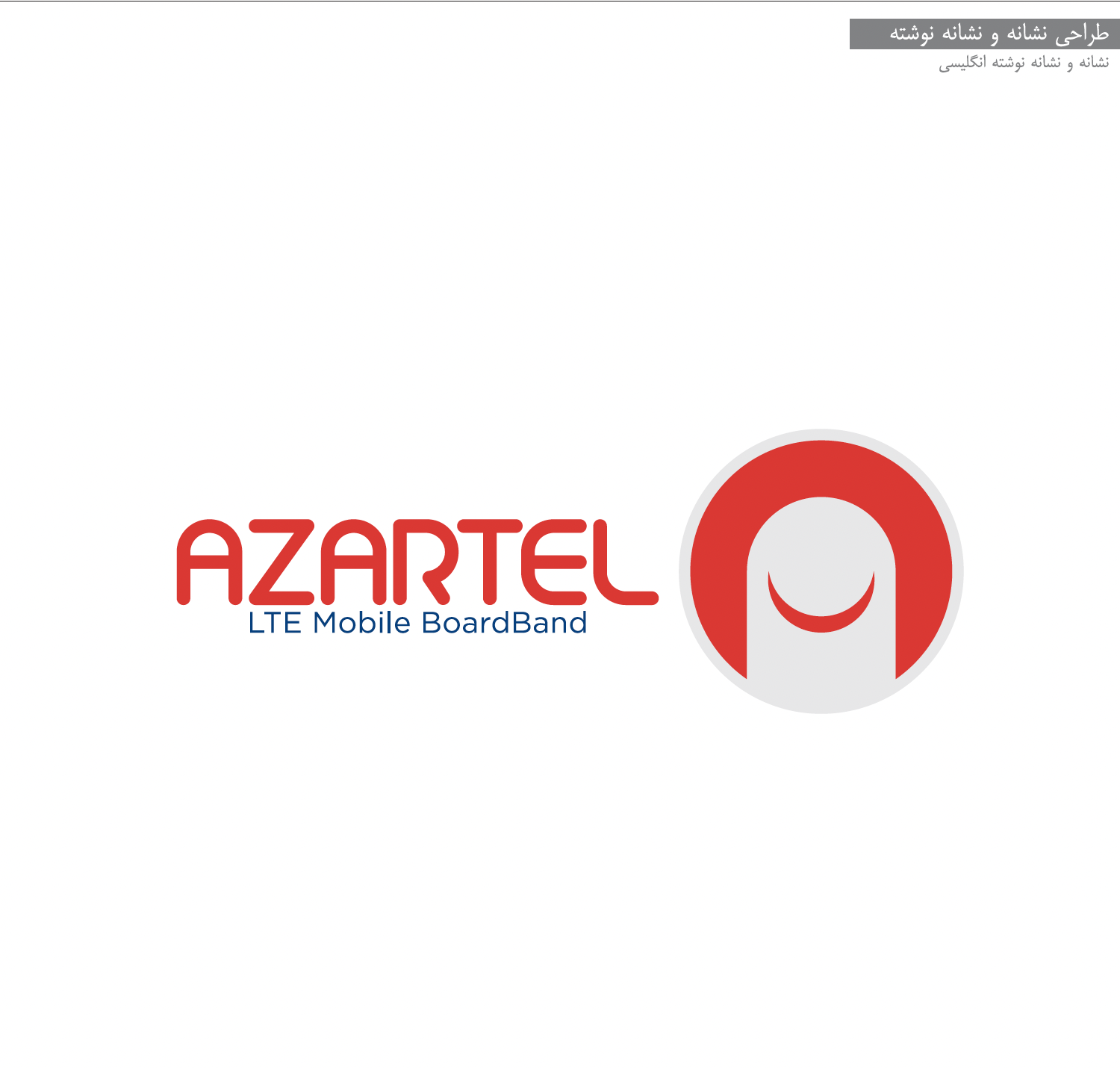
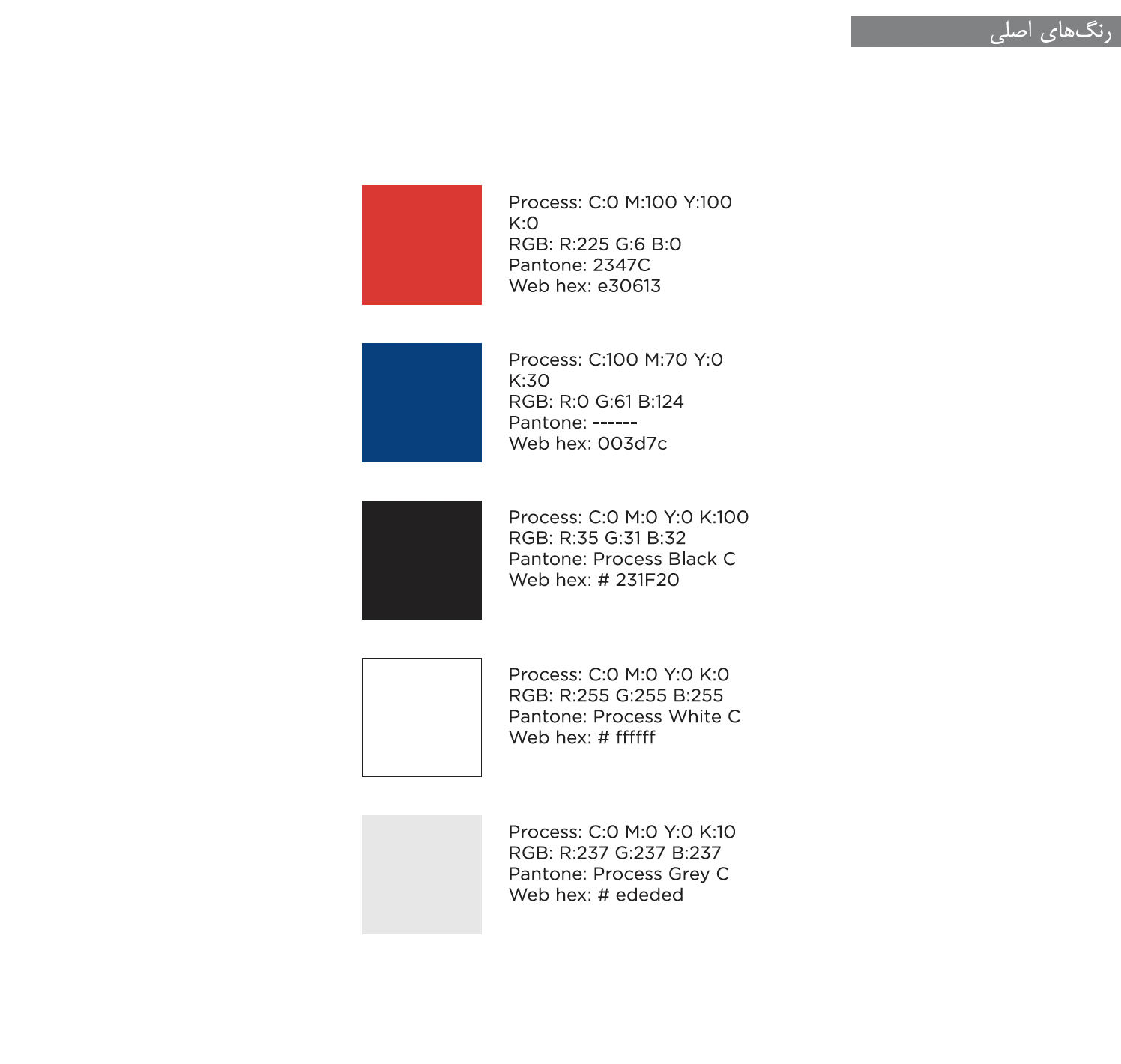
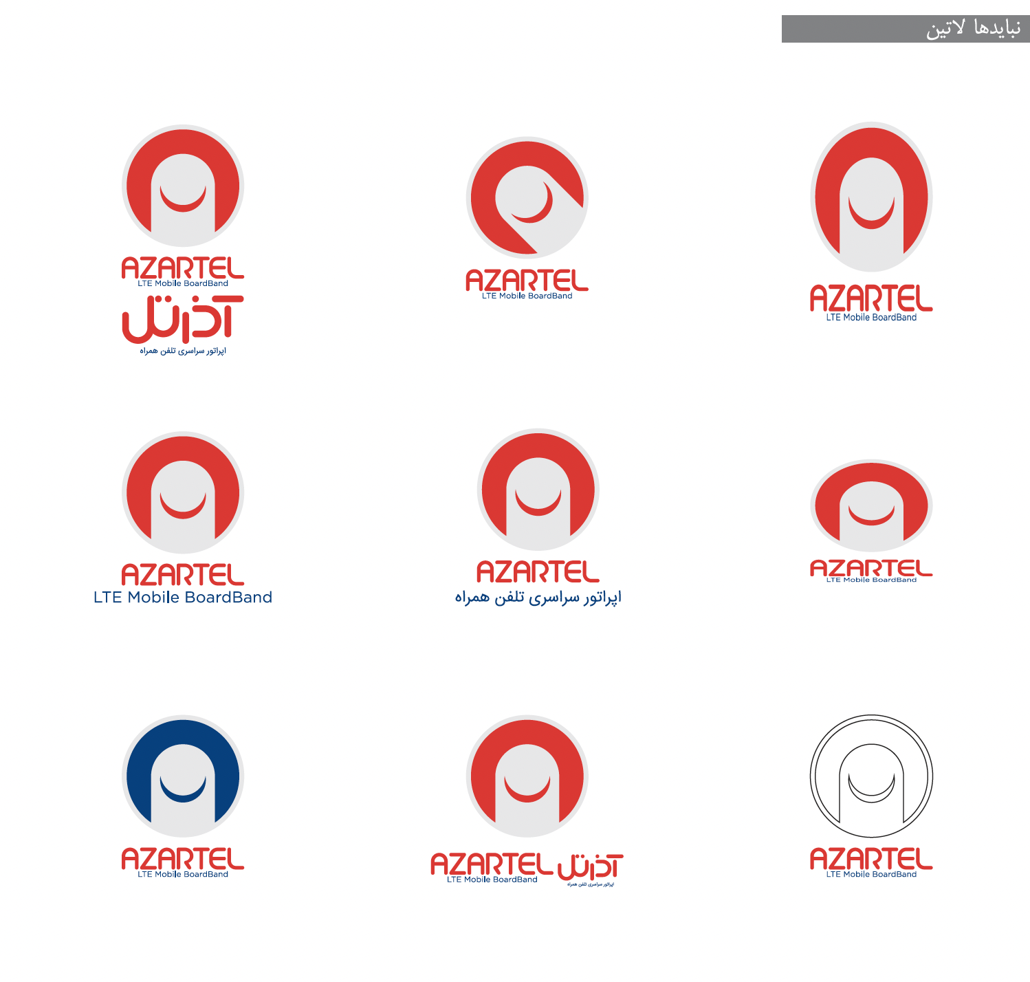
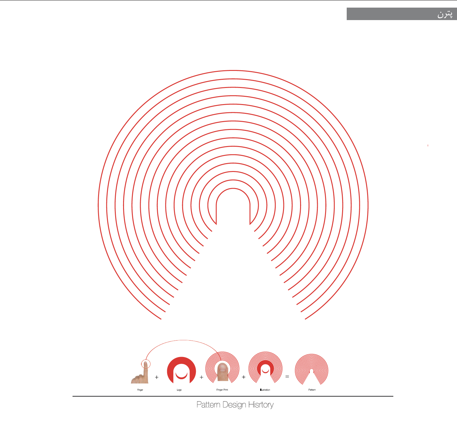
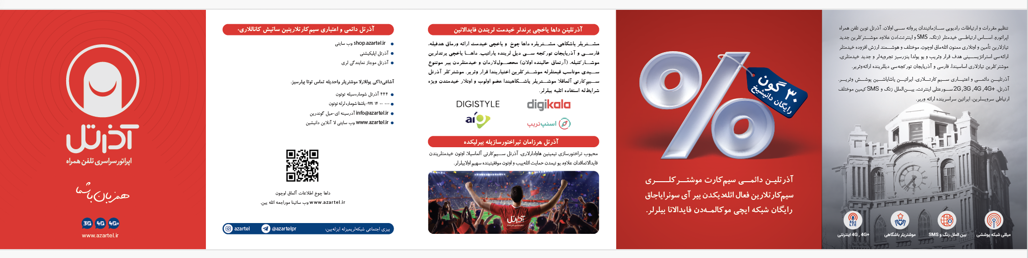
Azartel, now rebranded as Aptel, was a telecommunications provider offering regular services such as voice, messaging and data, while also specializing in niche markets. It provided services in two languages—Turkish and Persian—to uniquely cater to the Azerbaijani-speaking community. In addition to standard telecommunication offerings, Azartel developed tailored services and co-branded partnerships with a popular local football team to engage young adults (ages 20-35). The brand’s visual identity, featuring vibrant red and dark blue colors, reflected youth, energy, and excitement. Its logo, representing a finger touching a mobile screen with a curved line, symbolized a friendly connection, integrating technology, sports enthusiasm, and happiness.
Azartel (Mobile Virtual Network Operation)
Creative Lead
Brand Identity
2018
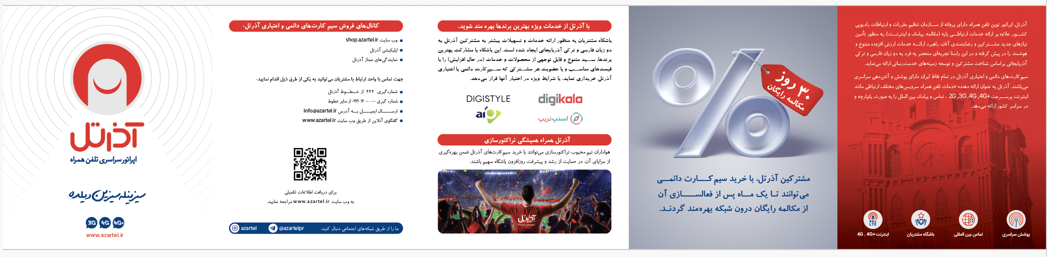
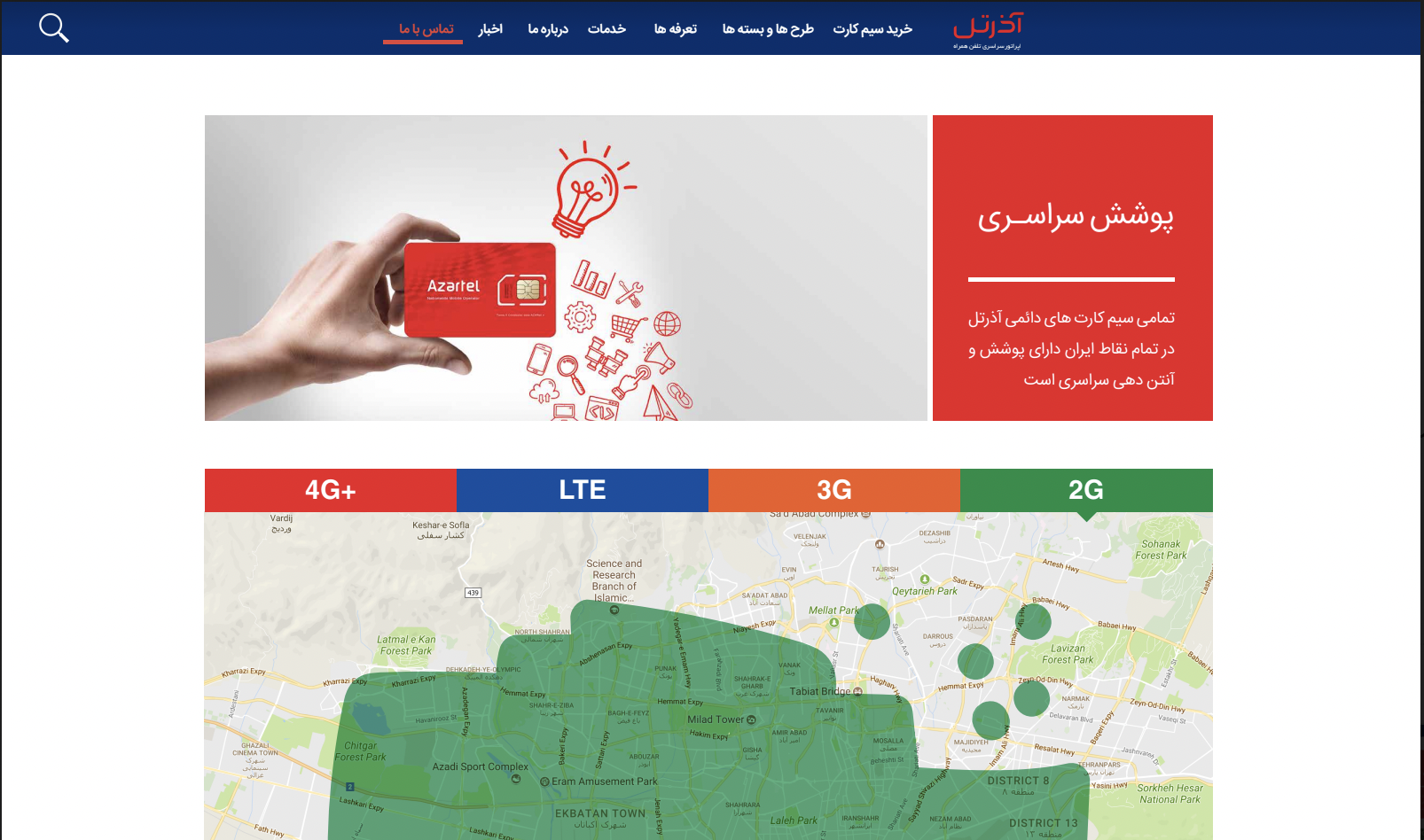
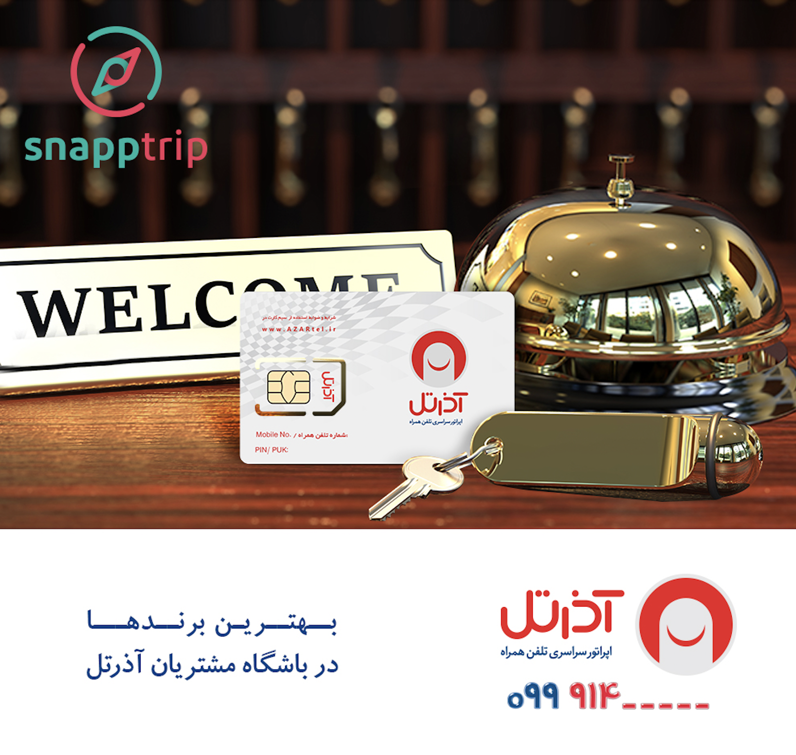
Azartel (Mobile Virtual Network Operation)
Brand/Creative Lead
Brochure, Website
2018
Architecture, Planning & Construction - IKAD
Logo & Stationary
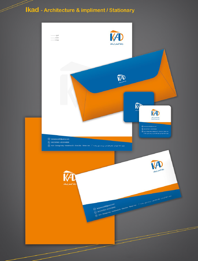
Ikad (Architecture, Planning & Construction)
Graphic Designer
Logo, Stationery
2018
Safety & Security Services - ATRABAN
Logo & other Brand Materials
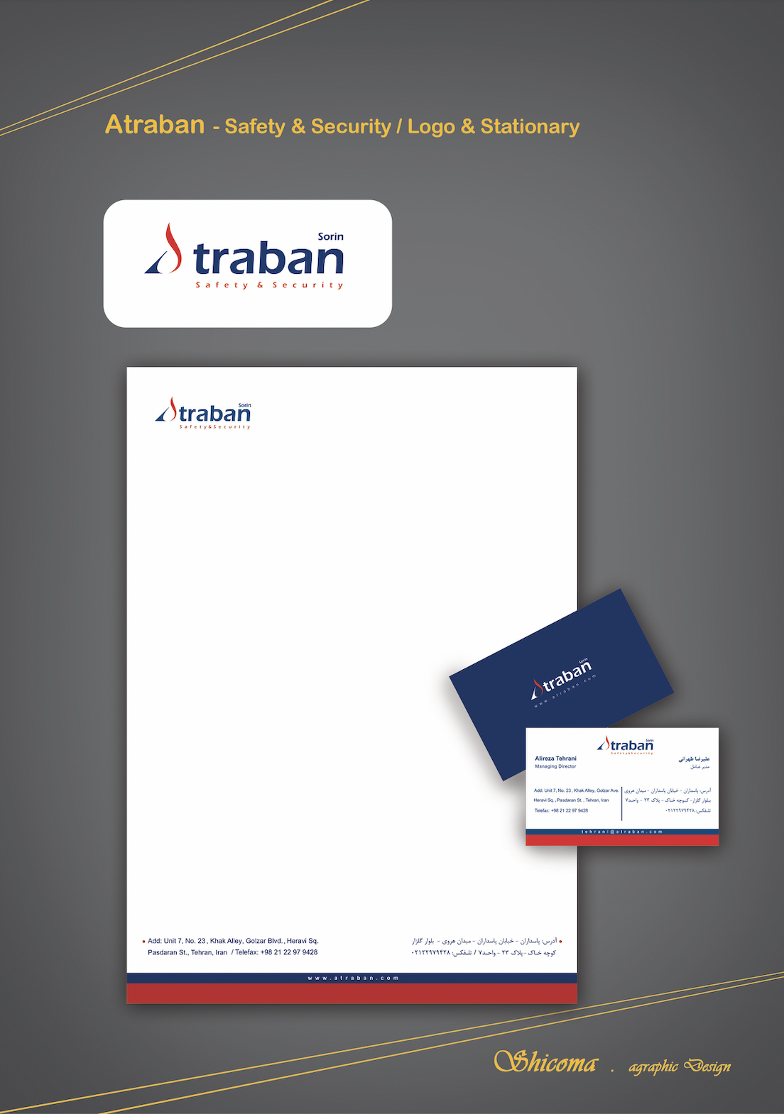
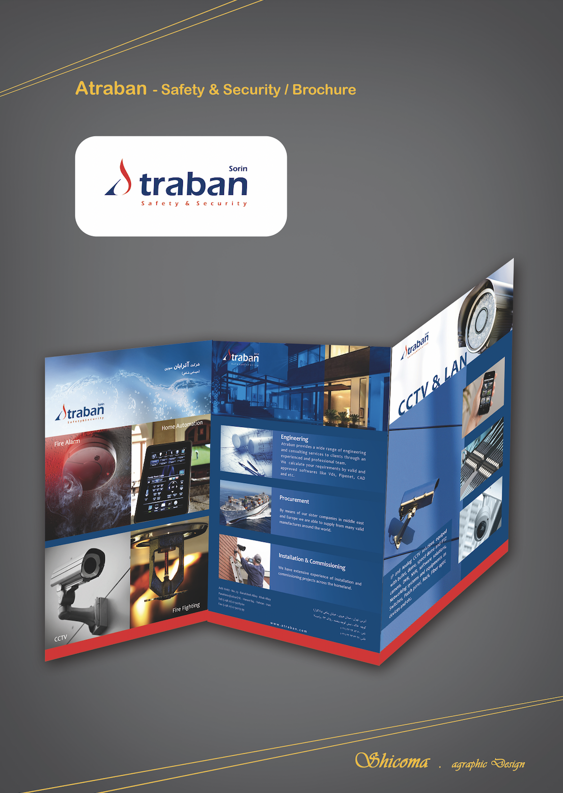
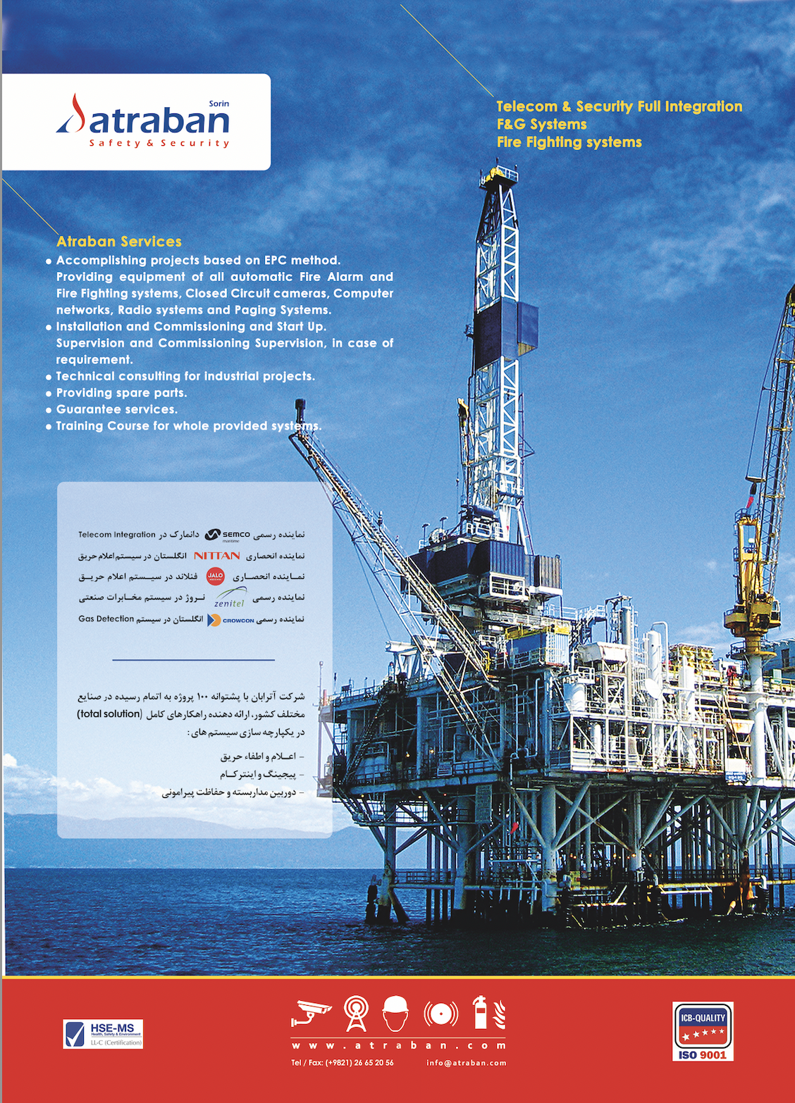
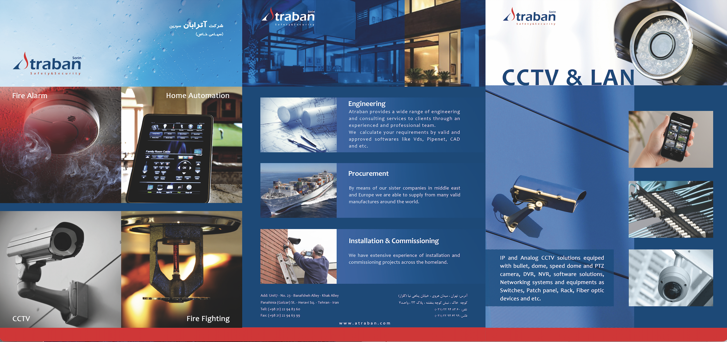
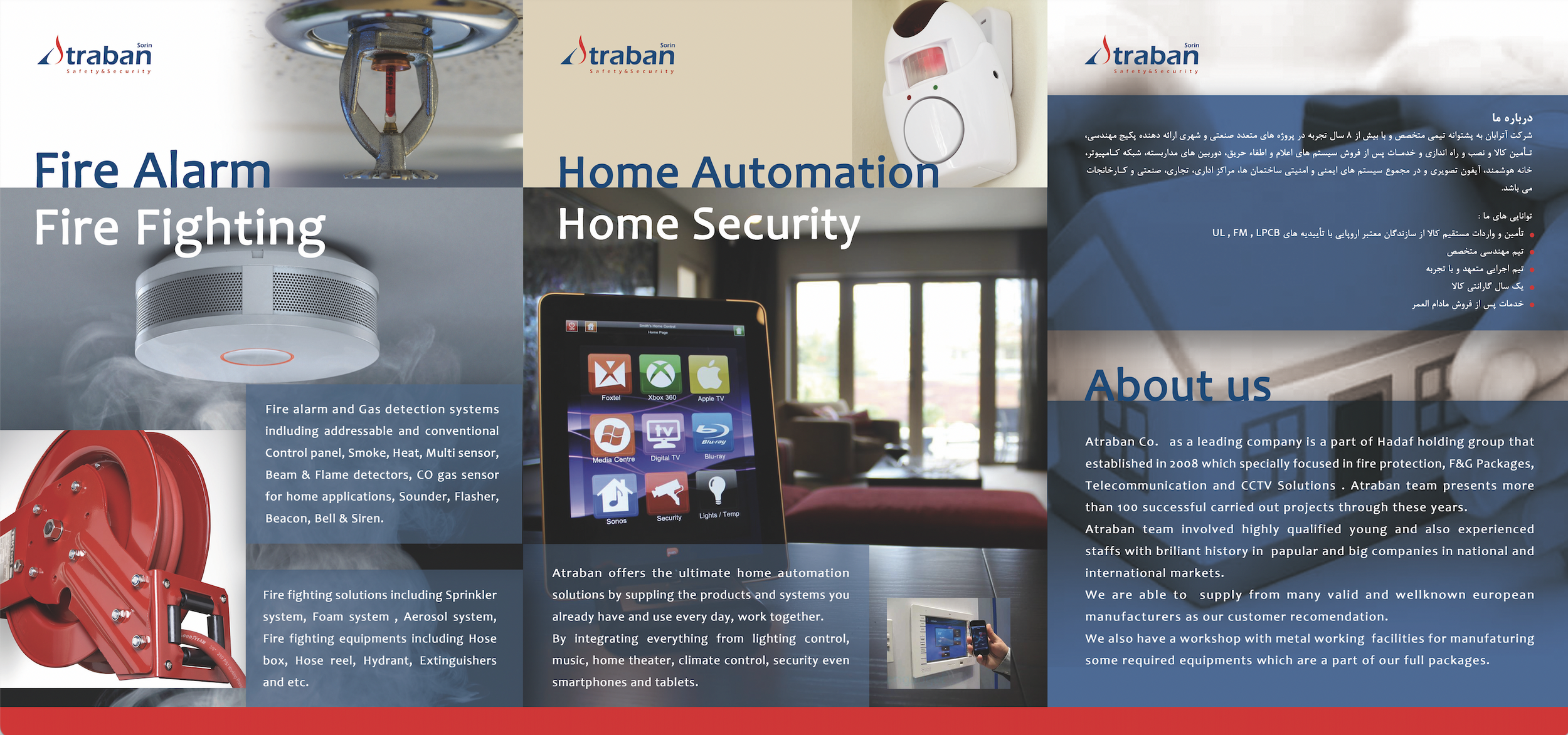
Atraban (Safety & Security Services)
Graphic Designer / Brand Lead
Logo, Stationery, Brochure
2015
FMCG Company - TONTY
Brand Identity - Packaging
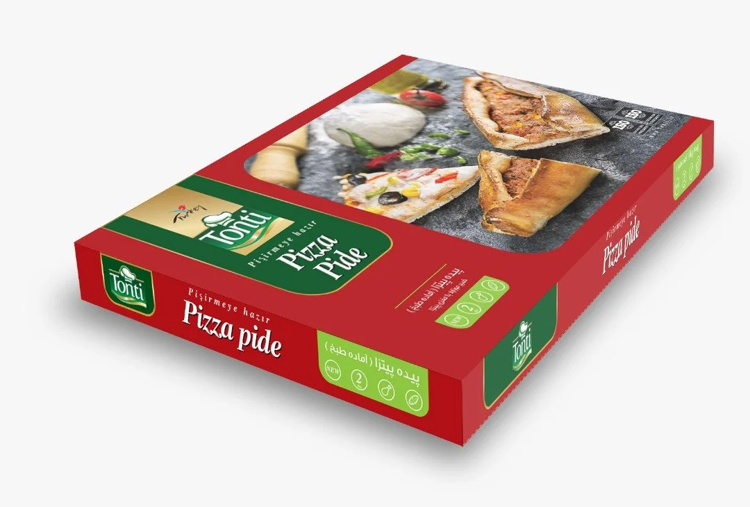
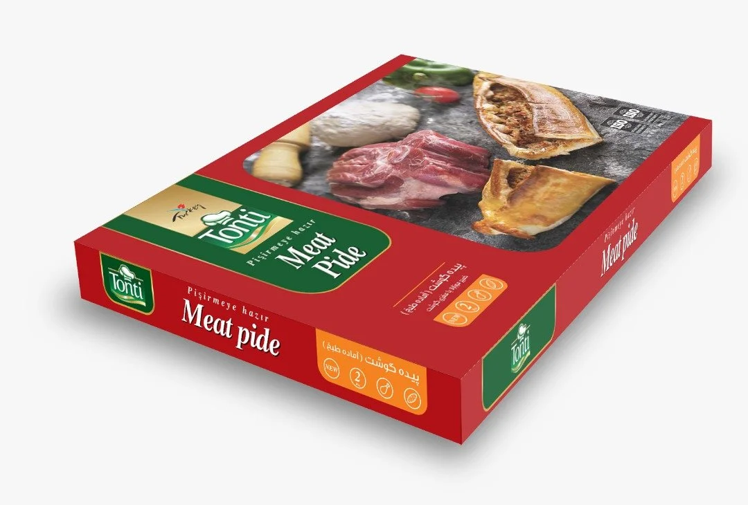
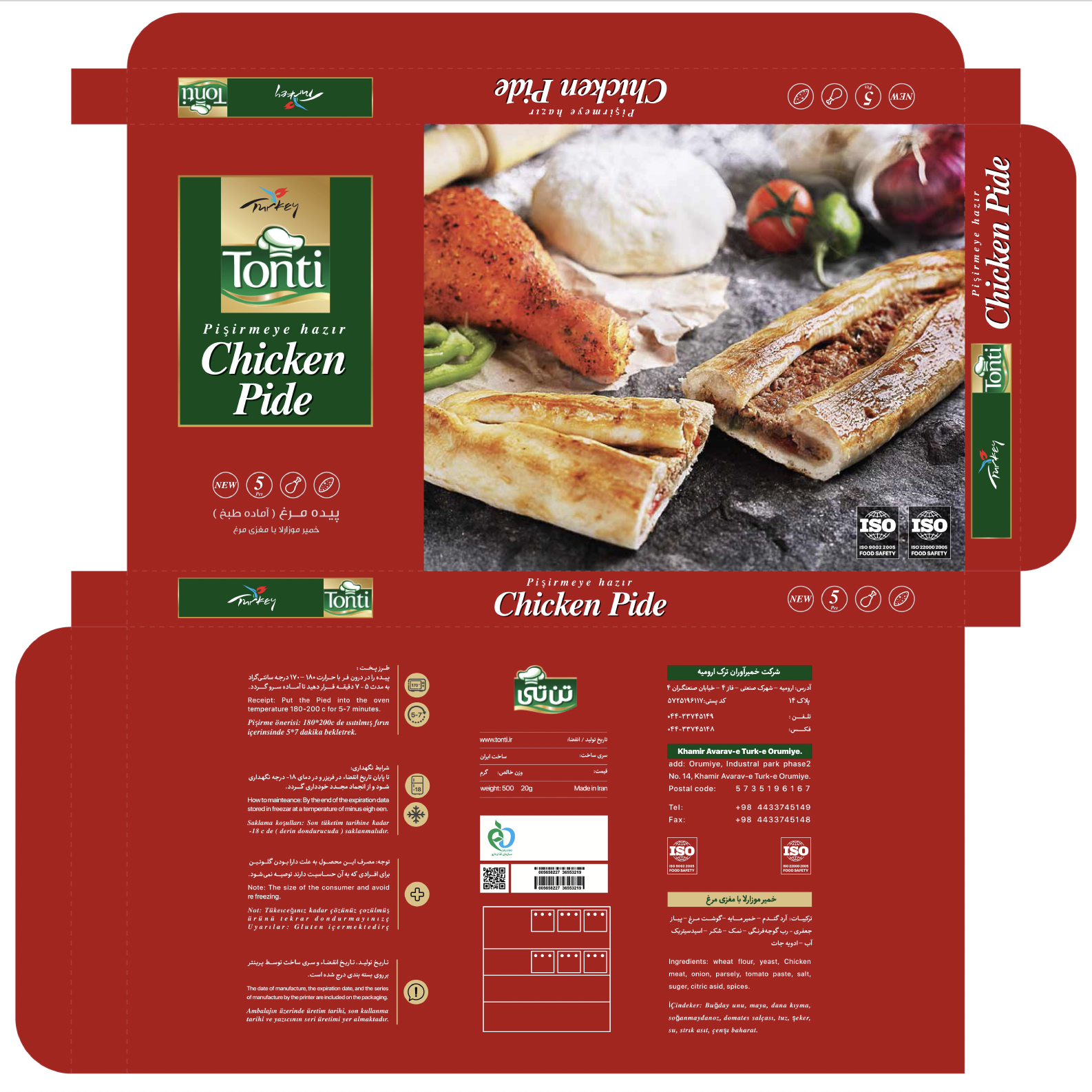
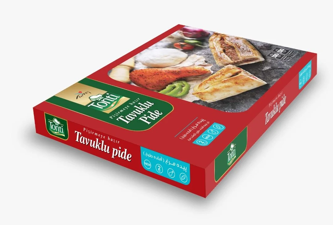
Tonti (FMCG Company)
Brand Consultant
Brand Identity, Packaging