

Brand Identity
In Print material , Digital Platforms & Product Design
Rightel Brand Identity and Guidelines
Objective
Rightel, the third mobile operator in the region, launched after two well-established competitors that held the first and second positions in terms of market share and subscribers. The objective was to create a dynamic and modern brand identity that not only stood out against these competitors but also appealed to Rightel’s target demographic. This involved adapting the brand to evolving market trends and technological advancements to attract and retain a younger, tech-savvy audience.
Concept and Design Development
The Rightel logo uses a circular motif to symbolize connectivity and continuous communication, essential in telecom. The curved lines represent signal flow, emphasizing fluidity. To differentiate from competitors, Rightel adopted a vibrant magenta and dynamic design, standing out from the more conservative, angular logos of its competitors, appealing to a younger, tech-savvy audience.
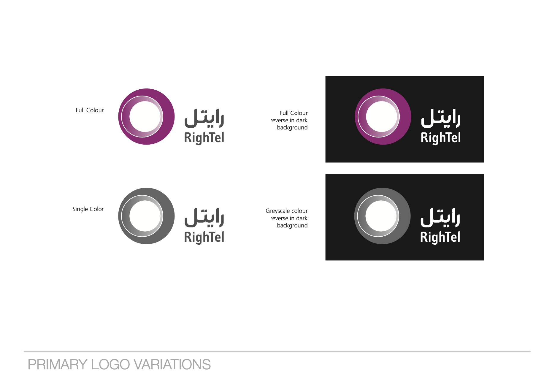
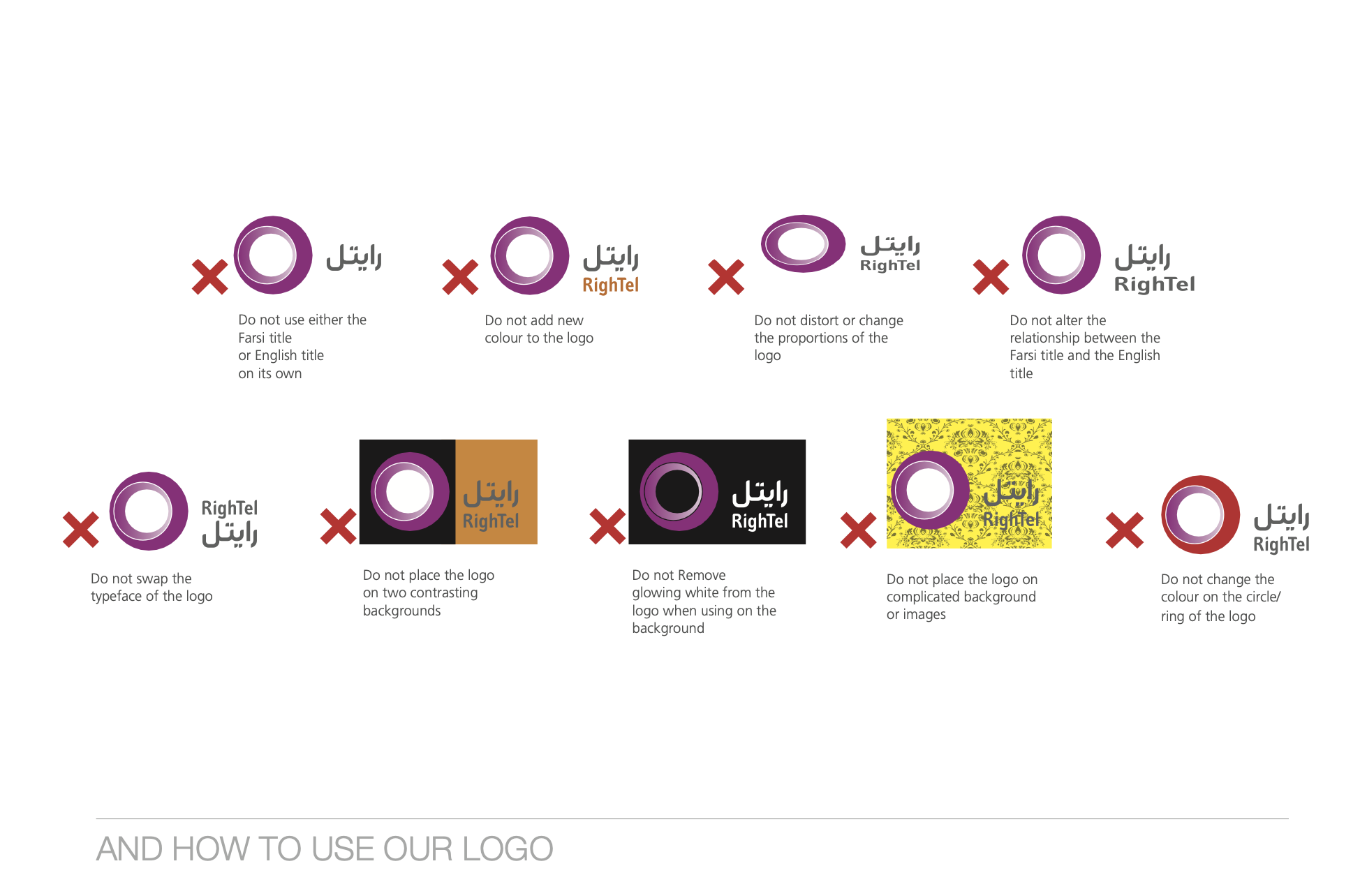
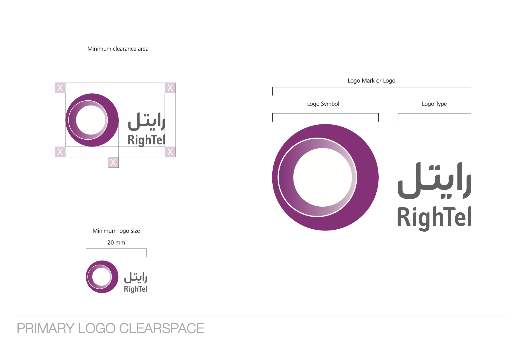
Logo Usage Guidelines
The Rightel logo usage guidelines ensure consistency and impact across all platforms. These guidelines emphasize maintaining clear space, correct proportions, and proper color use. Alterations, such as changing colors, distorting the logo, or using elements separately, are not allowed, and the logo should not be placed on complex backgrounds to preserve visibility and brand recognition.
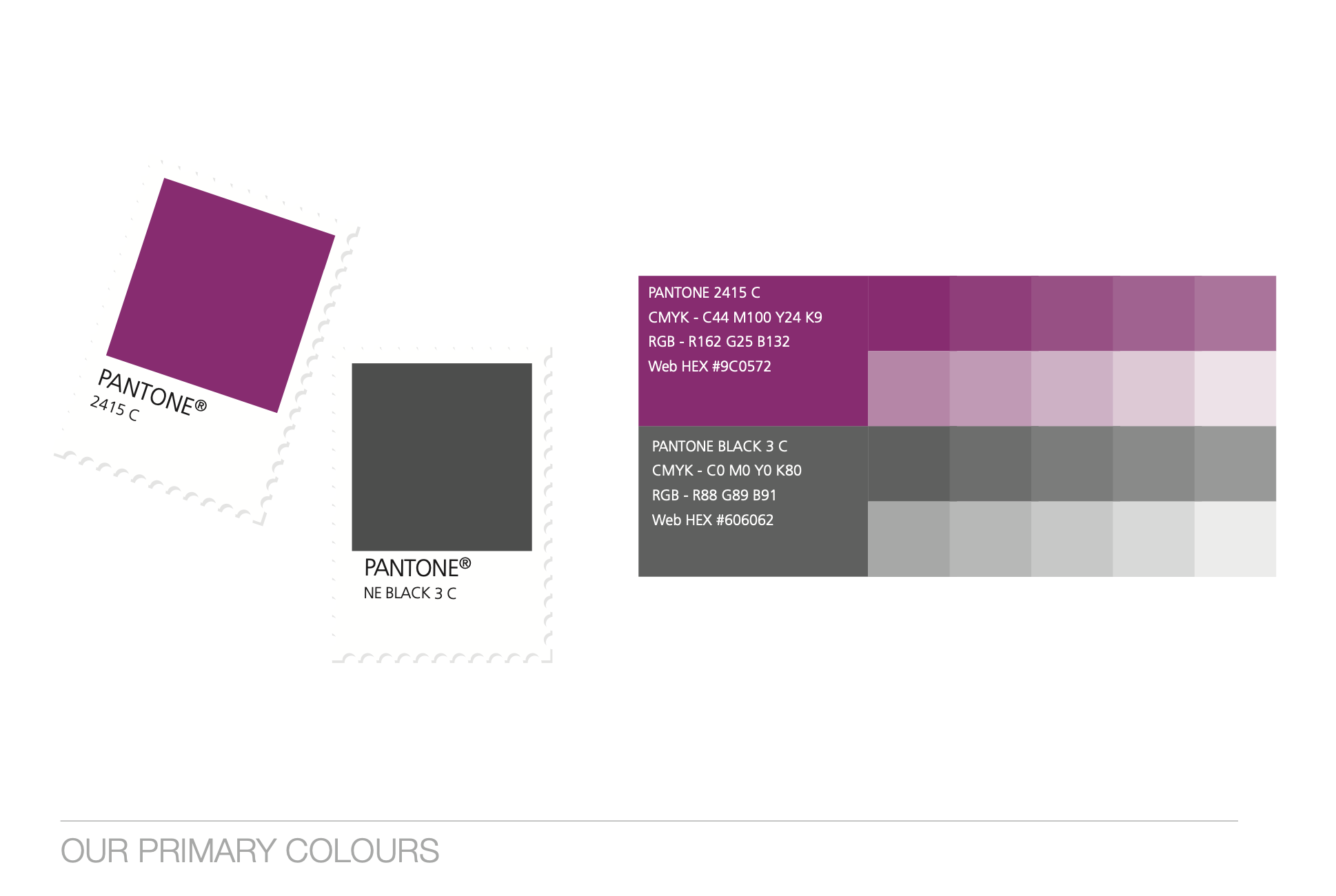
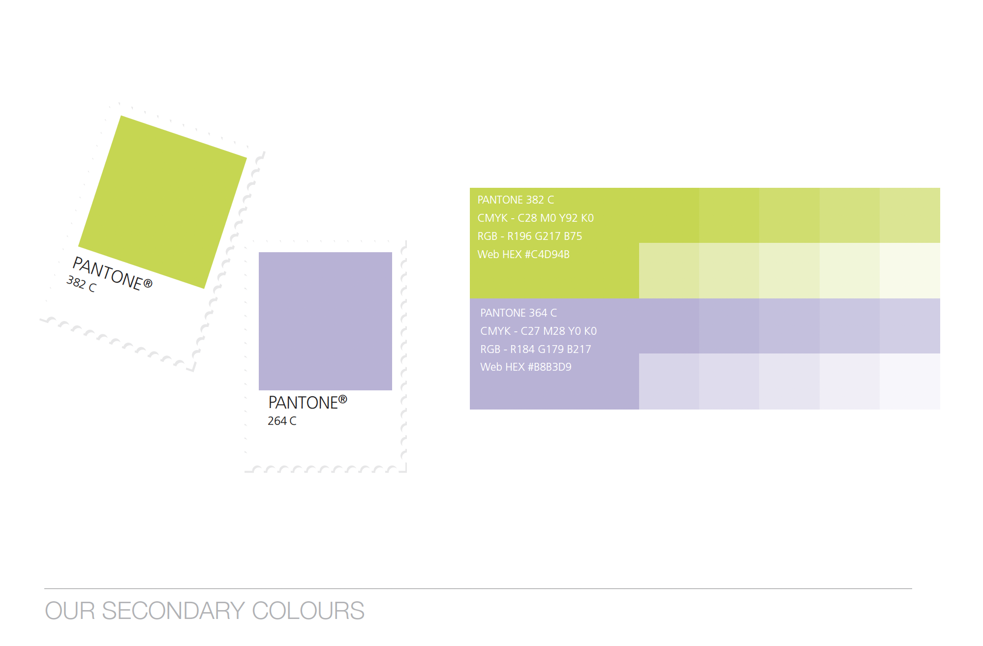
Primary & Secondary Colors
Rightel's color palette includes a bold magenta (Pantone 2415 C) and neutral gray (Pantone Black 3 C) as primary colors, reflecting energy, innovation, and professionalism. The tonal variations within these colors allow for flexible use across various media, maintaining a consistent and modern brand identity. The secondary palette features a vibrant lime green (Pantone 382 C) and soft lavender (Pantone 264 C), offering additional depth and versatility to the brand’s visuals, with tones that ensure a fresh and dynamic appearance in different contexts.